Affordable Care Act
Overview of the brand.
Brands, as a concept, are only as strong as their design and virtues. Patient Innovation Center's commitment to helping communities by bridging the gap to access to care through innovative services is the key to their iconic brand. See below for list of these company virtues.
Outreach, Personal, Innovative, Education, Health
Jack, the conerstone of the PIC's logo, borrows from the mathematic symbols of nodes and edges. The circle nodes at the end of Jack represent the company virtues and are connected by edges into a cohesive message. Connection and Innovation. This concept brings the organizations values together to form the intangible part of the brand.
Typography
To reflect the moderniterty and innovation behind the brand expression we used two different square sans serif display fonts with grotesque character traits.
Color palette
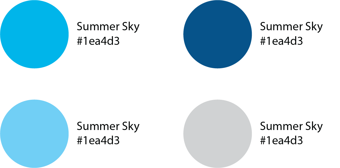
Sitting at the intersection of healthcare and software, we chose a color palette that is situated between those two industry. According to MH Designs Blue appears a dominant color in 59% of startup logos and 85% of all healthcare logos.
Illustration
Custom icons to further brand expression.
Tangibles
Strategic Partners
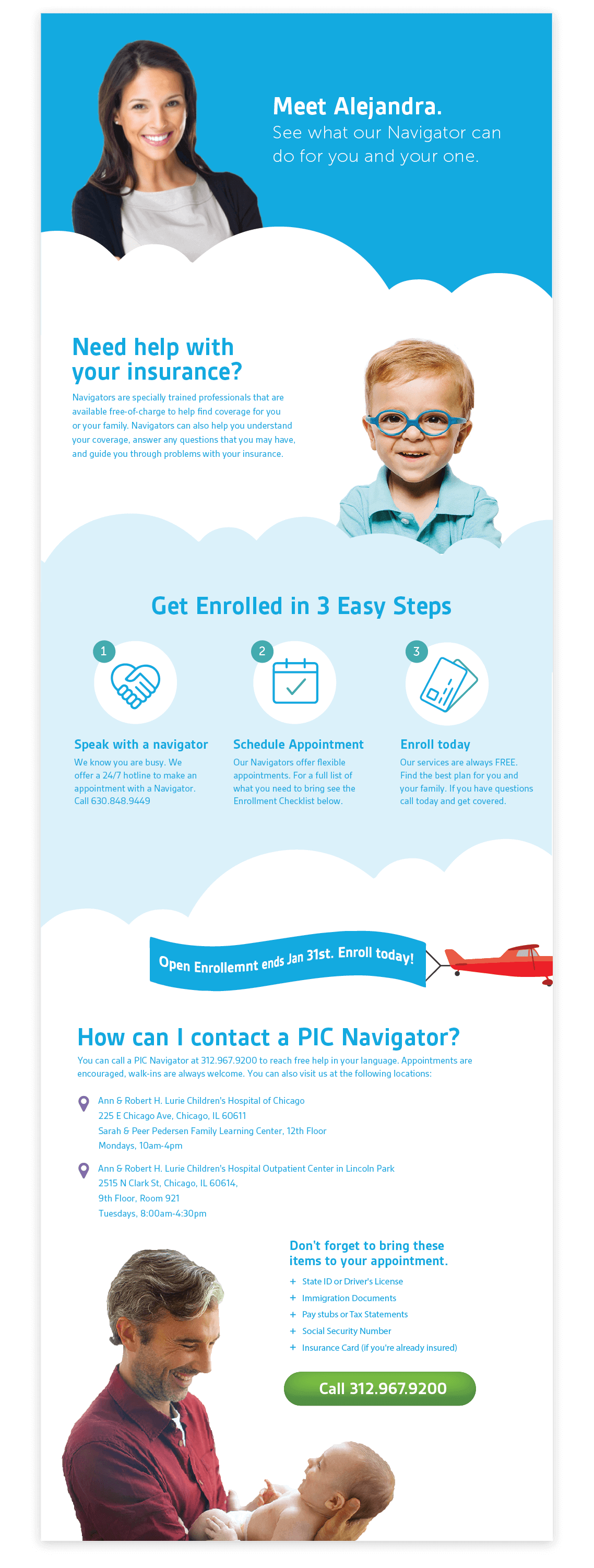
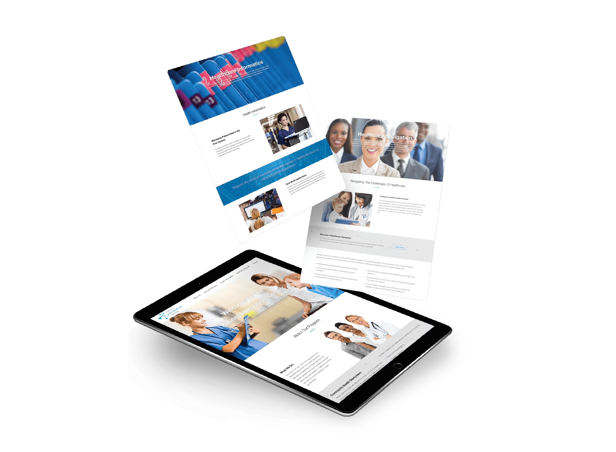
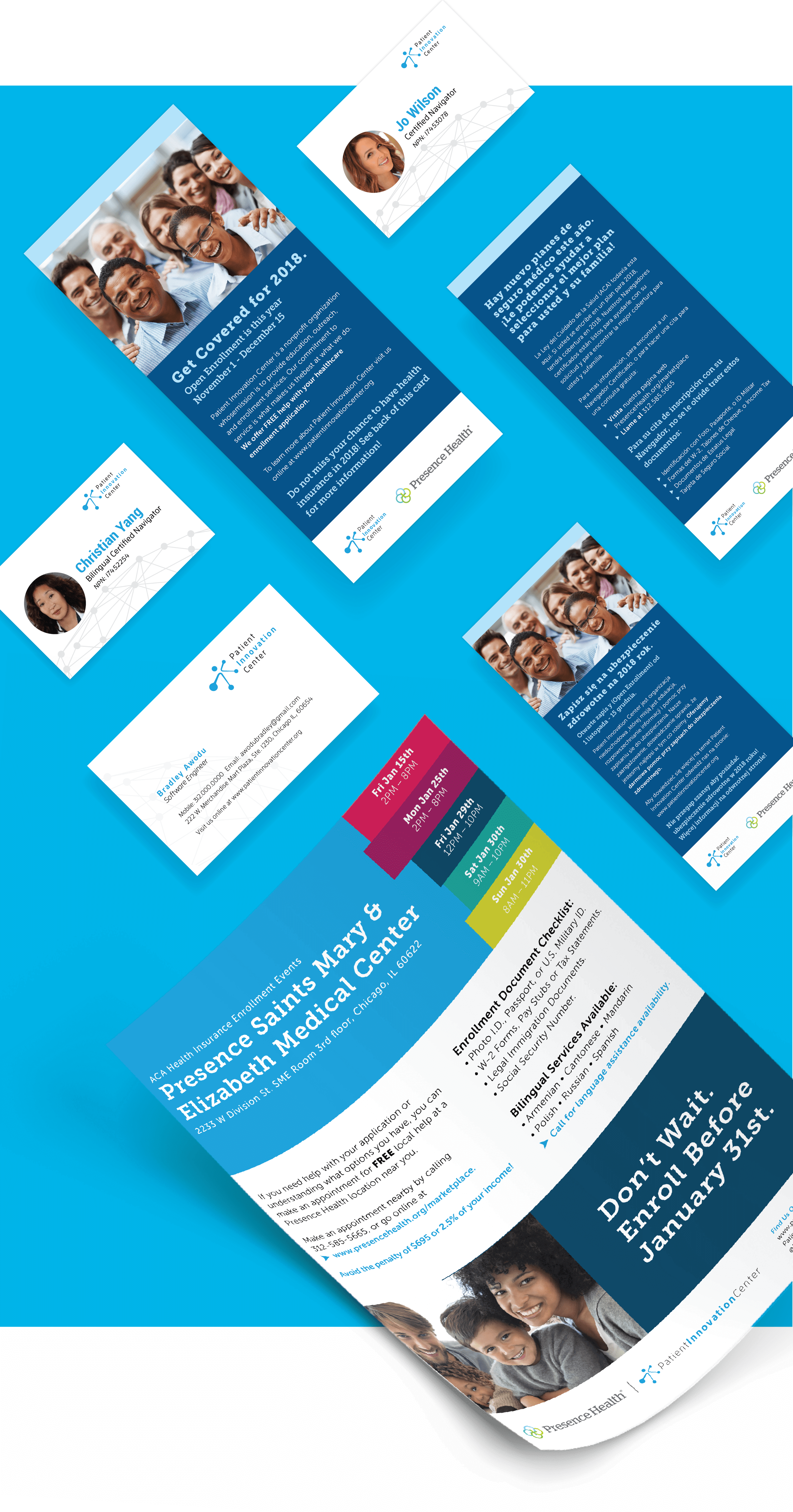
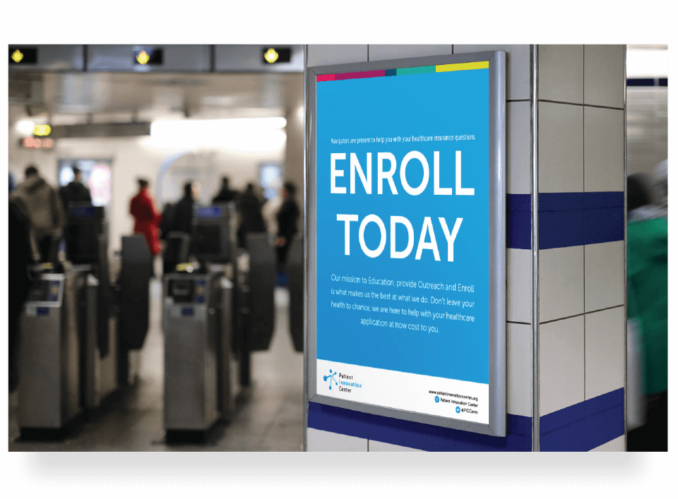
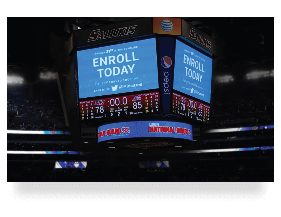
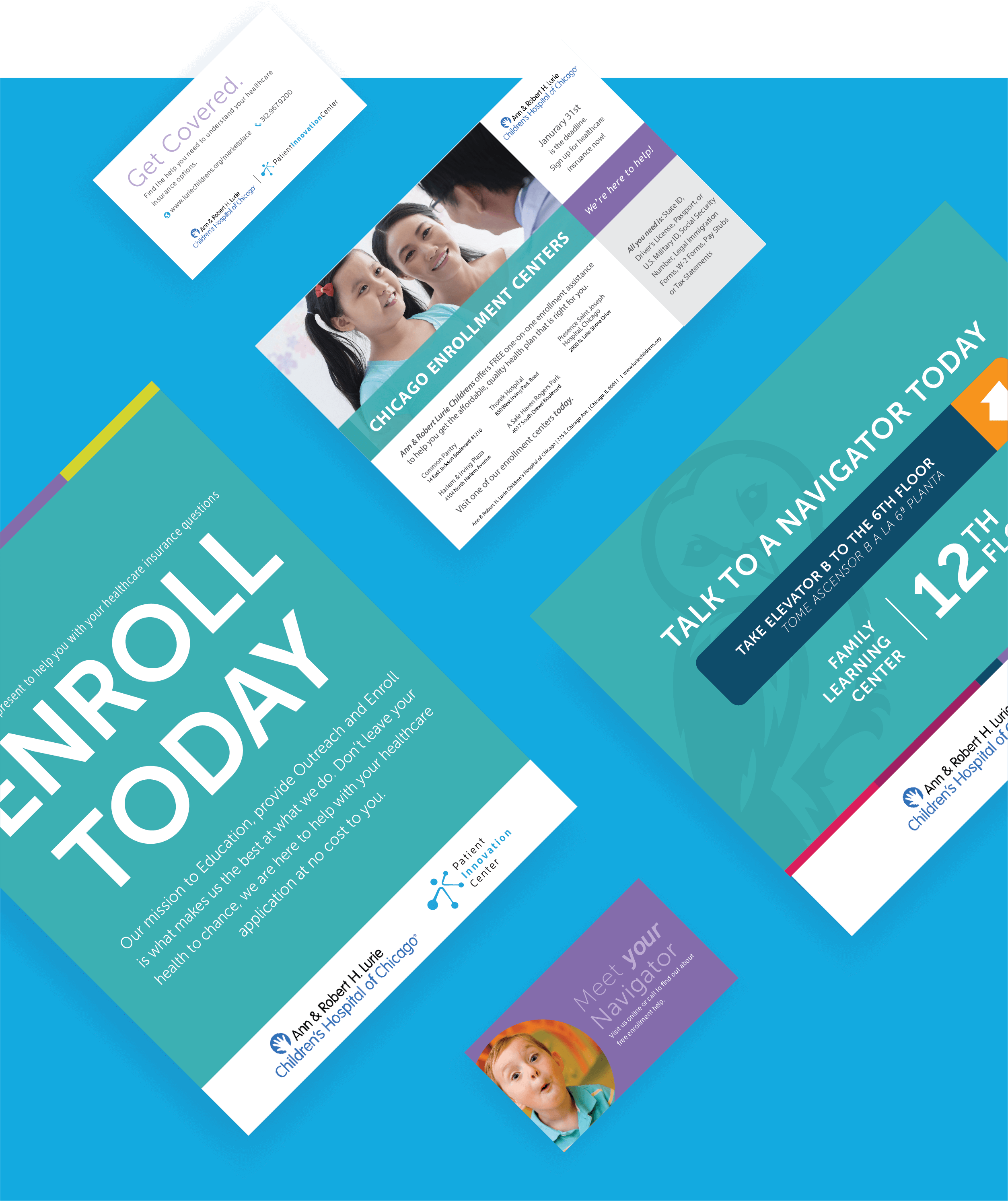
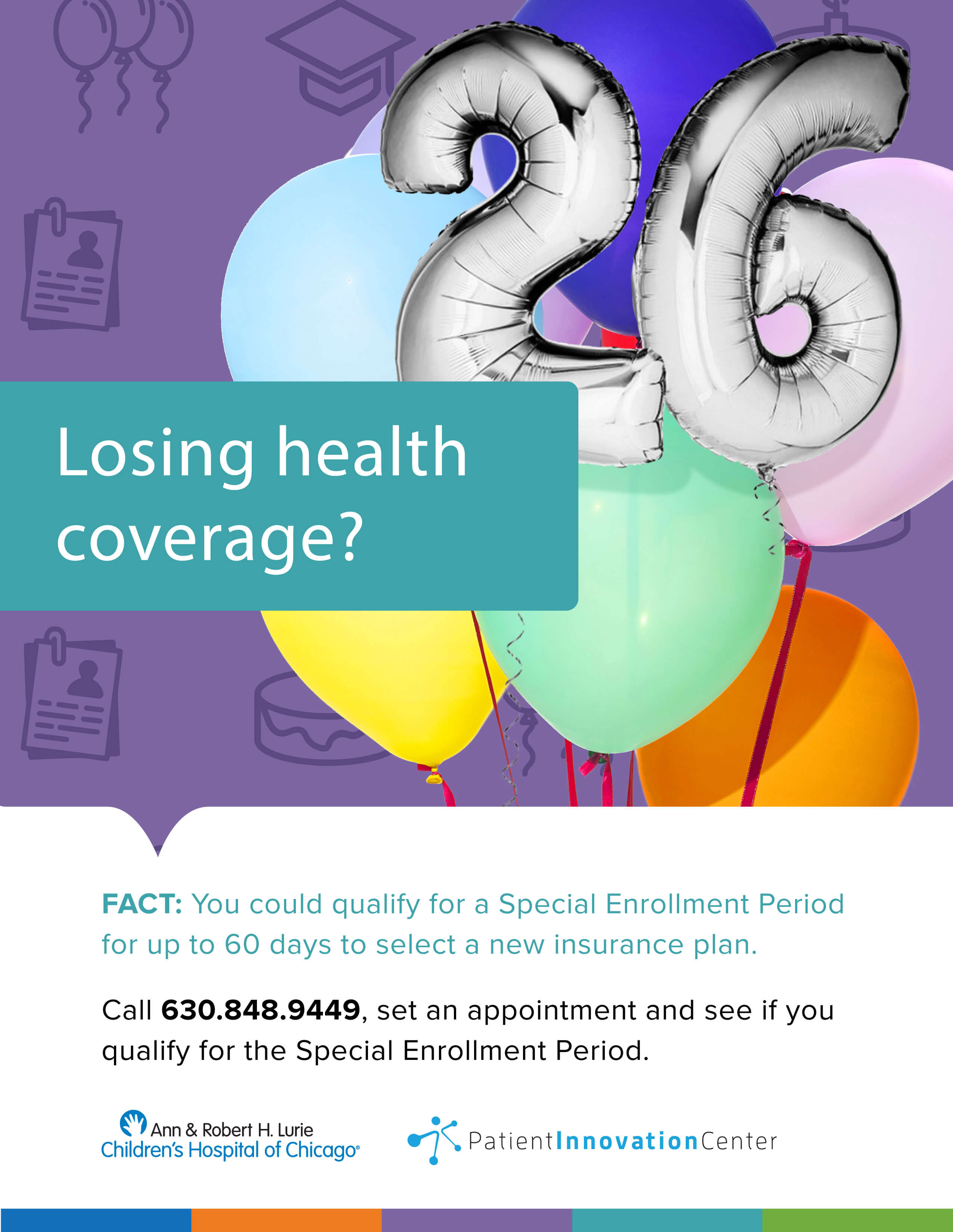
Patient Innovation Center approached the marketing department of this hospital with the goal of establishing dedicated healthcare navigation on location. As part of this partnership I was tasked with creating co-branded signage, mailers, flyers and a landing page to advertise our services to the hospital's patients.
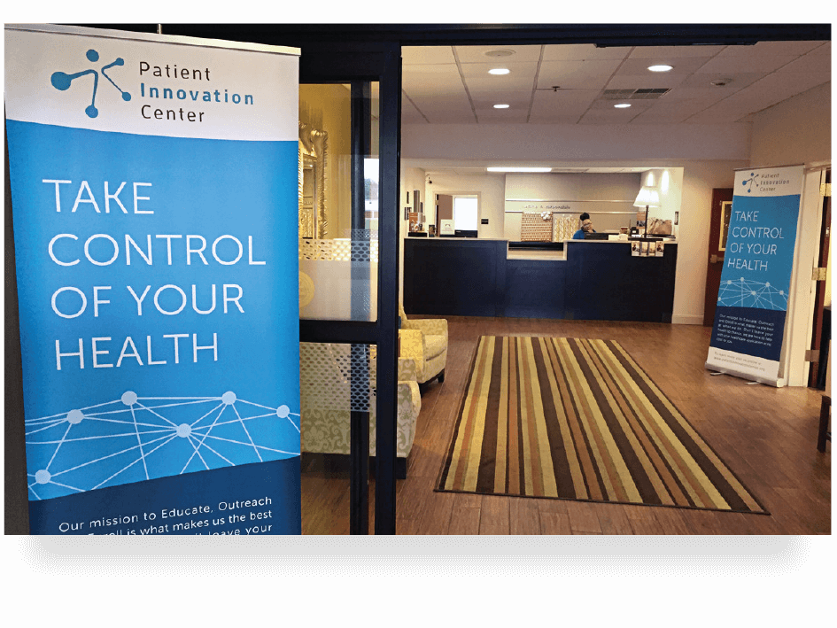
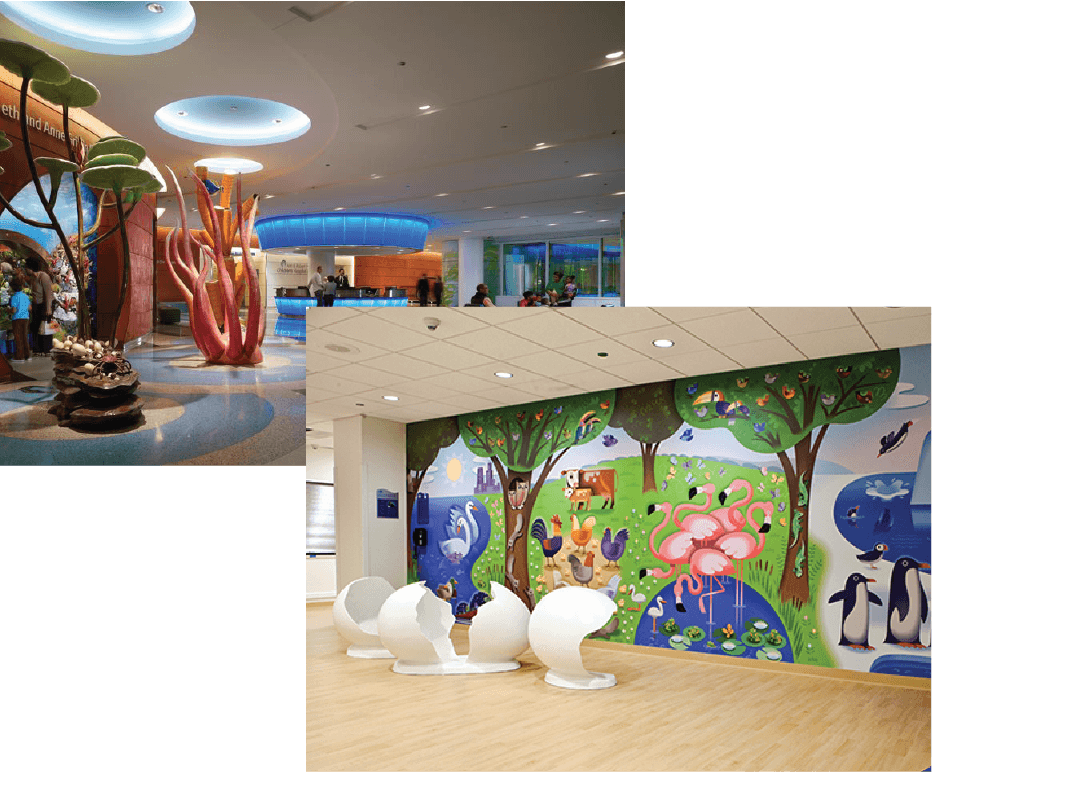
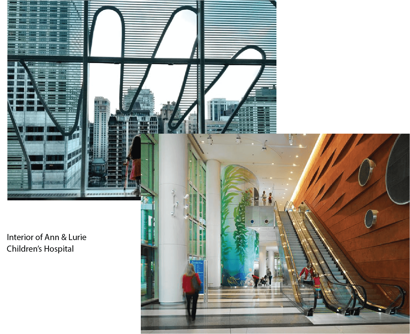
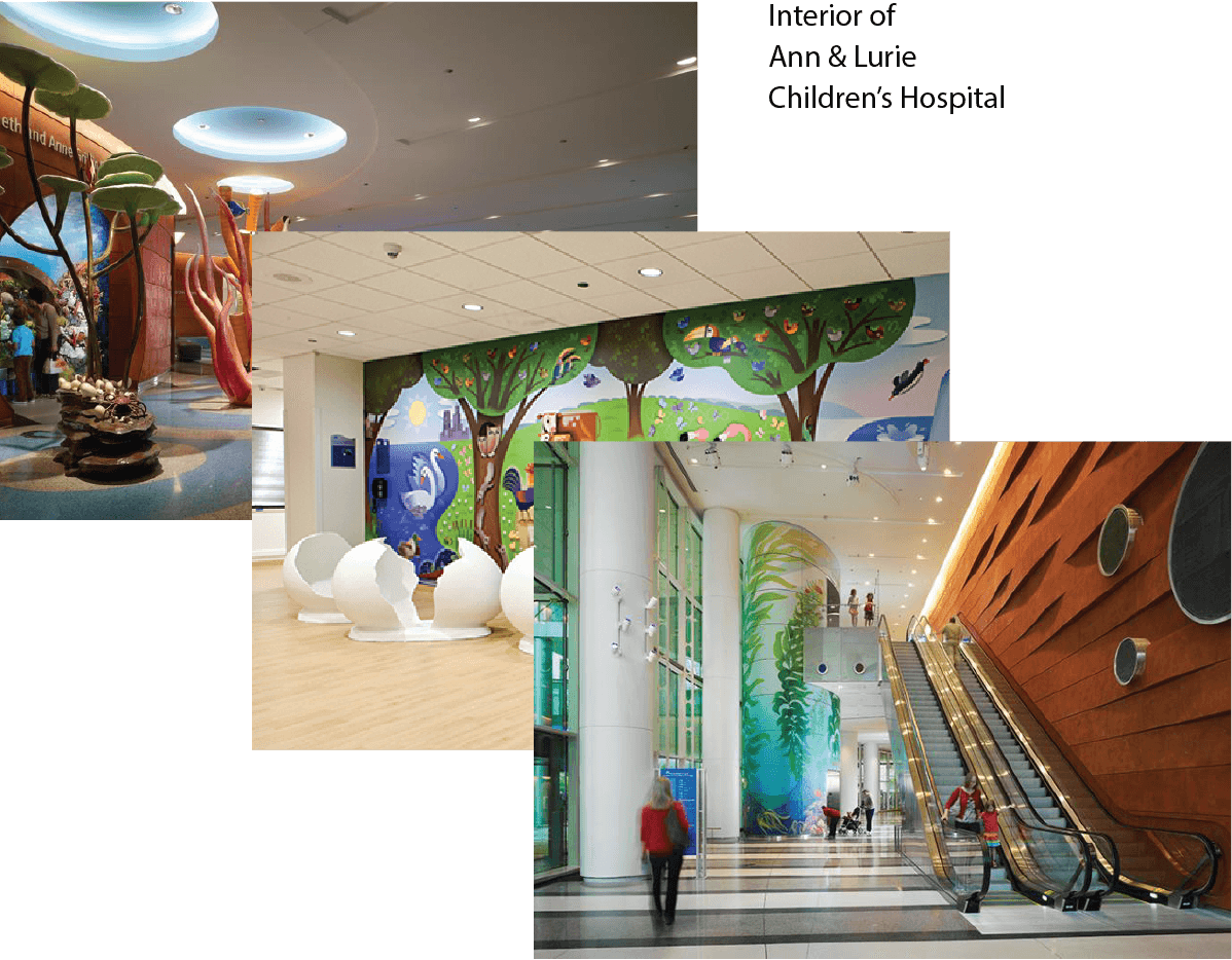
Interior shots show how we drew inspiration from the hospitals existing brand and imaginative themes to influence our design decisions. Overall the aim was to have each marketing piece complement the hospital's unique design, while also combining some of the whimsy of it's physical footprint that is not as apparent in it's online presence.


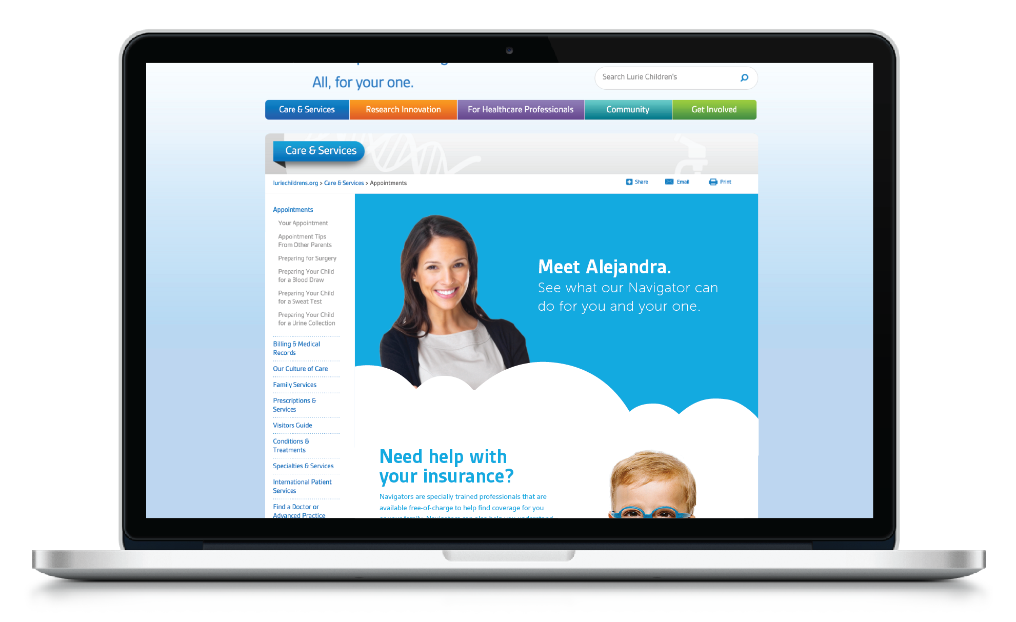
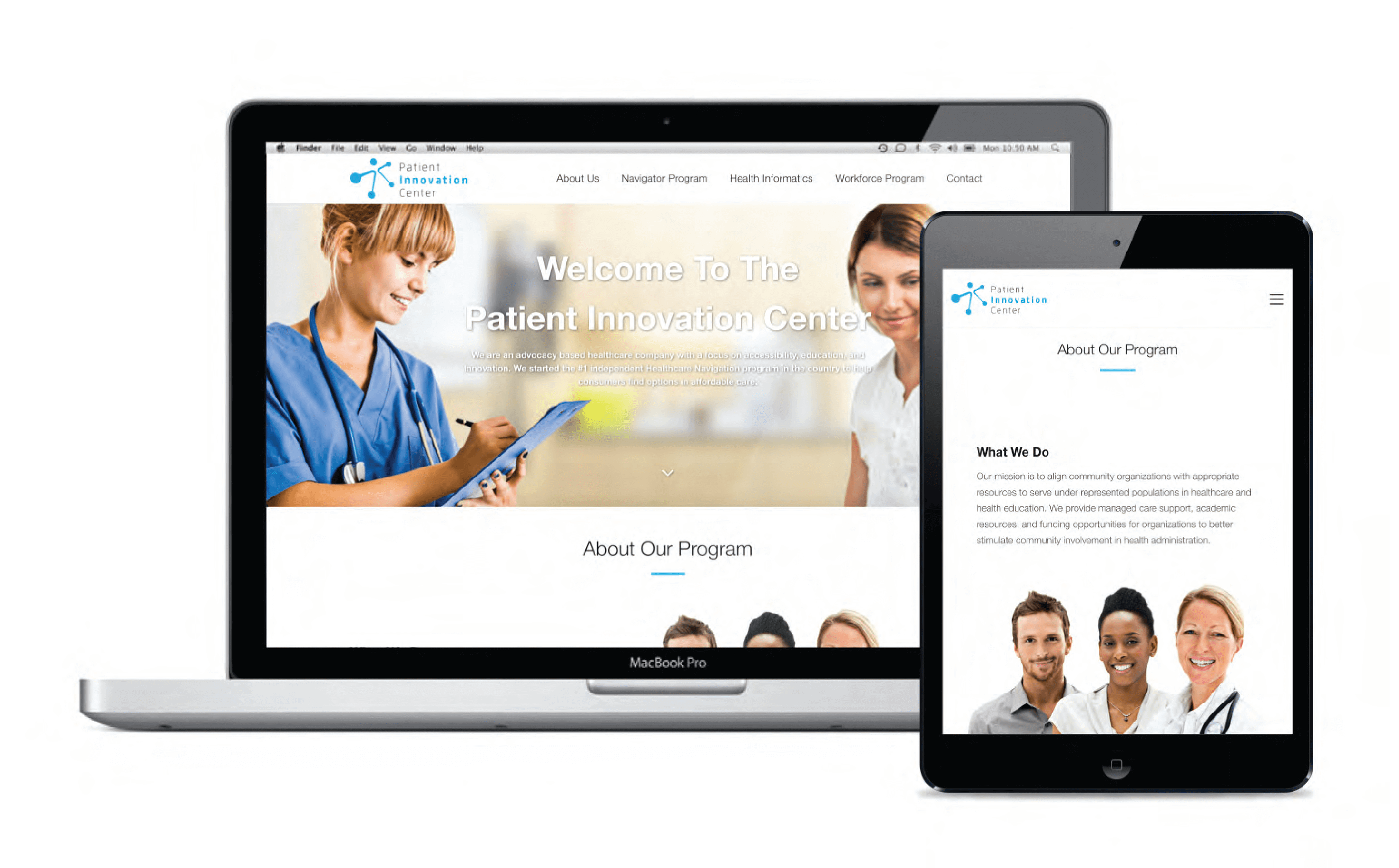
Visibility on partner websites.
Leaveraging the hospital system's web traffic was a crucial piece to our marketing efforts. As lead designer I worked in tandem with PIC's developers and Lurie's marketing team to design a landing page with the express purpose of increaing appointment volume. Engagment focused on informing potential clients of our service before prompting them to an appointment schedular (also built in-house).