Company
Caxy Interactive
Deliverables:
Sitemap, user flows, wireframes, high fidelity prototype, moodboard, branding
Industry:
Relocation Management
Background
Relocation Management Companies (RMCs)—the firms that companies hire to manage the logistics of employee relocation—largely stayed out of the technology revolution that swept through many other industries. Faced with slow adoption of digital process balanced with a need to drive cost down, increase compliancy and update aging legacy software; IOR Global Services, tapped Caxy to help build a reliable REACT platform. Over 8 weeks, using agile and human-centered methodologies, we were able to analyze IOR’s workflows and produce task-driven workflows in a mobile-first Progressive Web App
My Role
As lead designer for the project, I was involved in all phases of the project from research and design to production. Tasks included converting user insights into wireframes, creating high fidelity mockups as well as some light branding. I worked directly with project managers, developers and the client to produce an improved digital experience for their users.
User Experience Design Process
Using lean UX, agile methodologies and human-centered practices, over 4 weeks, we developed a process to understand and build the unique combination of structure, content and user experience that would accomplish our clients goals. Since this project was built from the ground-up we started our process with discovery and research.
| Spring 1: Discovery | Sprint 2: Visual Design |
|---|---|
| • Business Goals vs. User Goals | • Wireframes |
| • User stories/persona | • Design System (UI Kit) |
| • Information Architecture | • High Fidelity Mockups |
| • Moodboard | • Prototype |
Sprint 1: Discovery
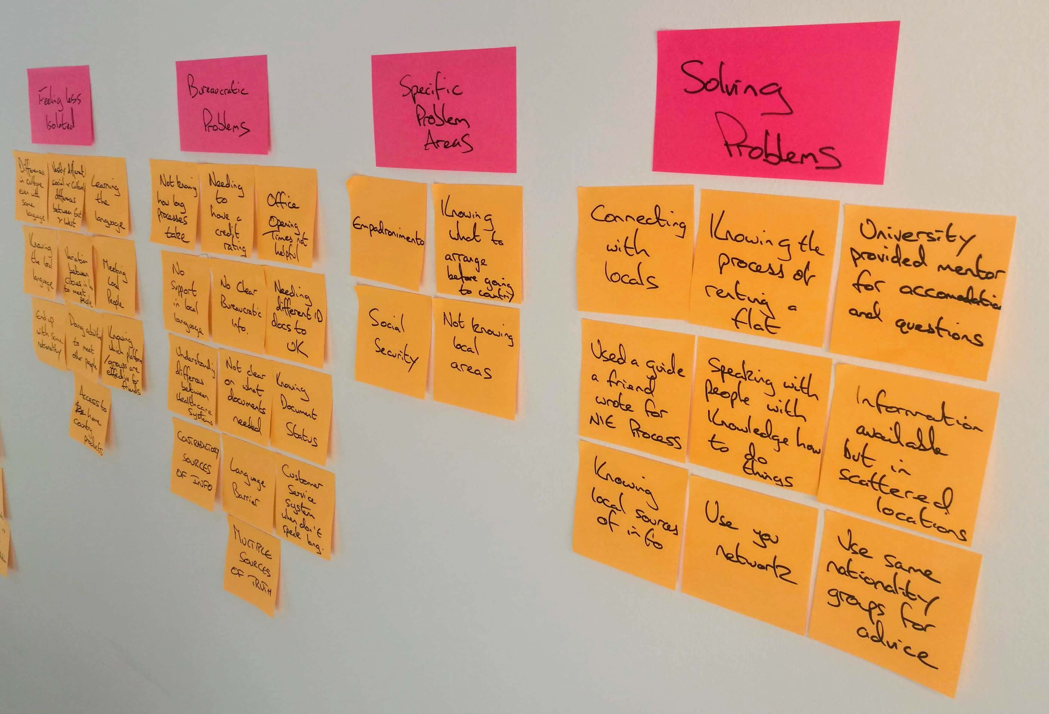
Before any design or development we worked with the client in a breakout workshop to discern their biggest pain points and how to validate them within the features within the app. By having a better understanding of the core business goals, users, their roles and most common pain points we were able to walk away with key insights and questions to answers during later stages in the project.
Goals:
| Leverage new software to: |
|---|
| • Increase compliancy and performance among IOR Consultants |
| • Increase user experience and performance among assignees/students |
| • Lower cost by monitoring relocation programs |
| Key Pain Points: |
|---|
| • Information, including documents between consultants and assignees are decentralized. Right now most information is passed via email |
| • Consultants have no easy way to analyze and track assignee performance |
| • Assignees have no easy way to communicate with consultant/program managers with questions related to program |
lorem ipsom dolor sit amet
lorem ipsom dolor sit amet
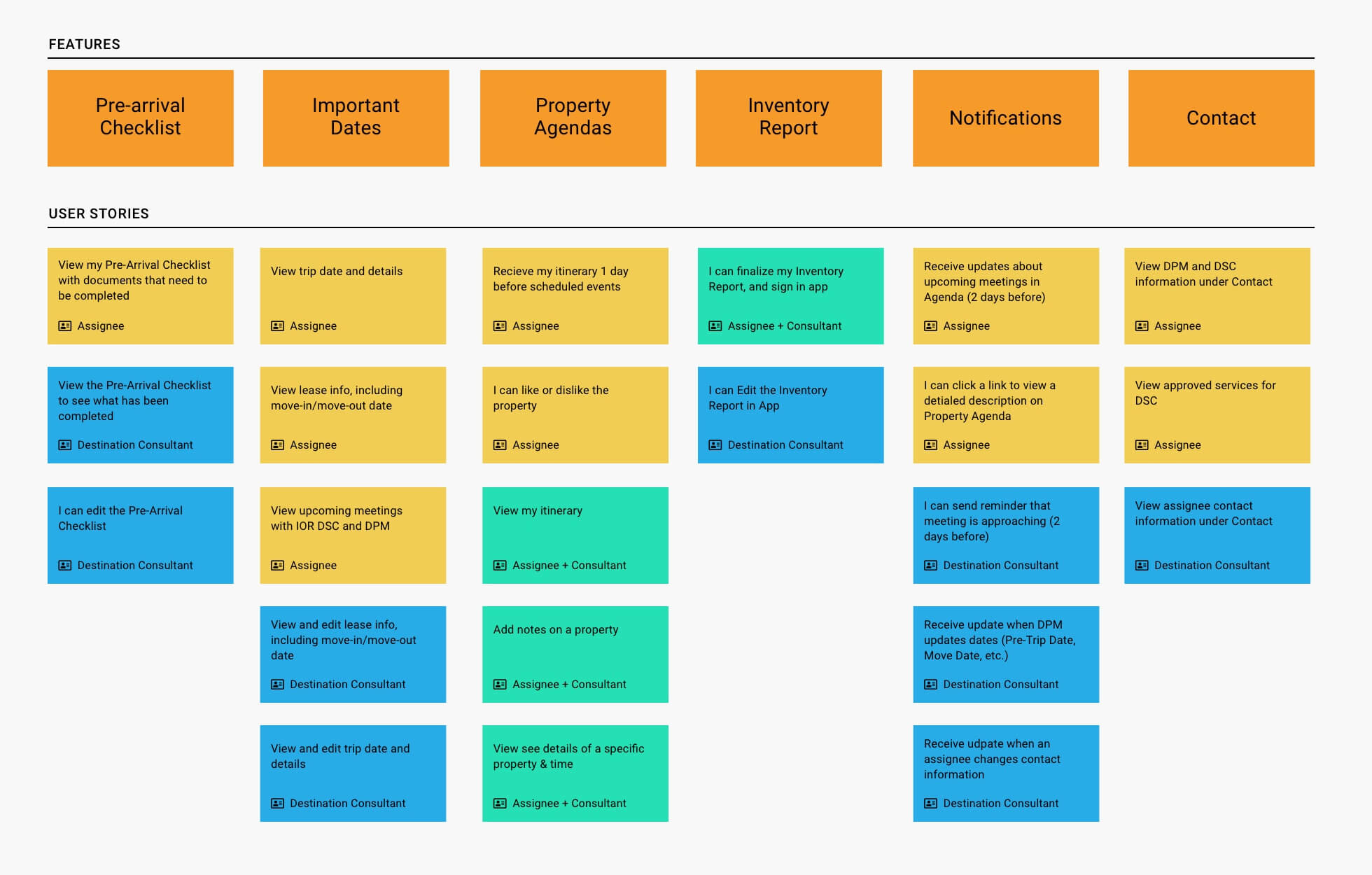
User Stories:
Building on the initial discovery research, we leveraged user stories focusing on the needs of each user type and their role: IOR Consultants (Destination Service and Language Training consultants), IOR admin and most importantly Assignees (new and returning).
- A user story is short, specific and goal-oriented. It is a one-sentence statement that tends to have the following structure: “As a ____, I want to ____, so that ____” (see below).
- User stories are collaborative design tools. All project stakeholders are expected to participate in the definition and sorting of user stories.
- User stories focus the project on the perspective of those who will use it.
To create the user stories we conducted cognitive walkthroughs, taking a step-by-step approach to understanding what task and goals would be accomplished at each screen. This collaborative effort helped us to describe pieces of functionality from a user’s point of view and identify content gaps while aligning team assumptions.

Information Archeiture
The product IA is divided into three core services, Language Training, Cultural Training and Destination Services; this hierarchy level was established to optimize what information a user sees and represents the three main service hubs where user goals occur. During this session our objective was to mitigate confusion by limiting , since a user could technically be assigned to one of these of service hubs, two or all three.
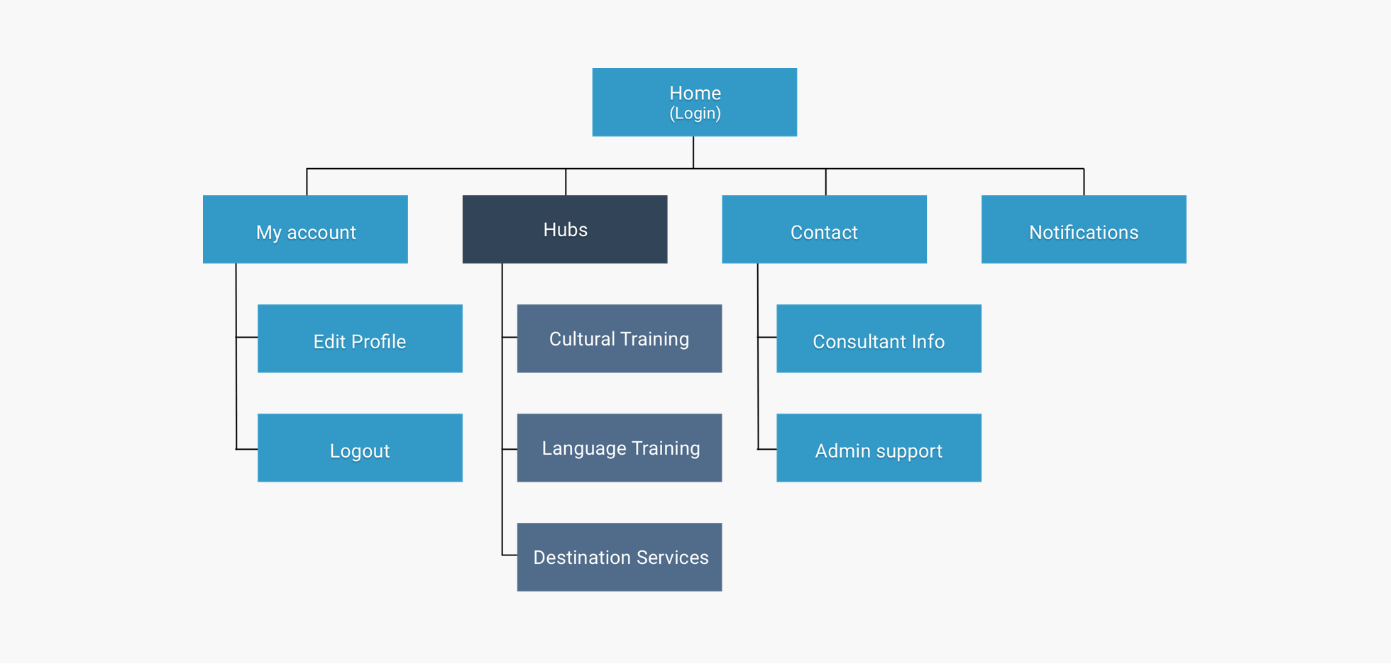
Sitemap showing an overview of the hiearchy levels
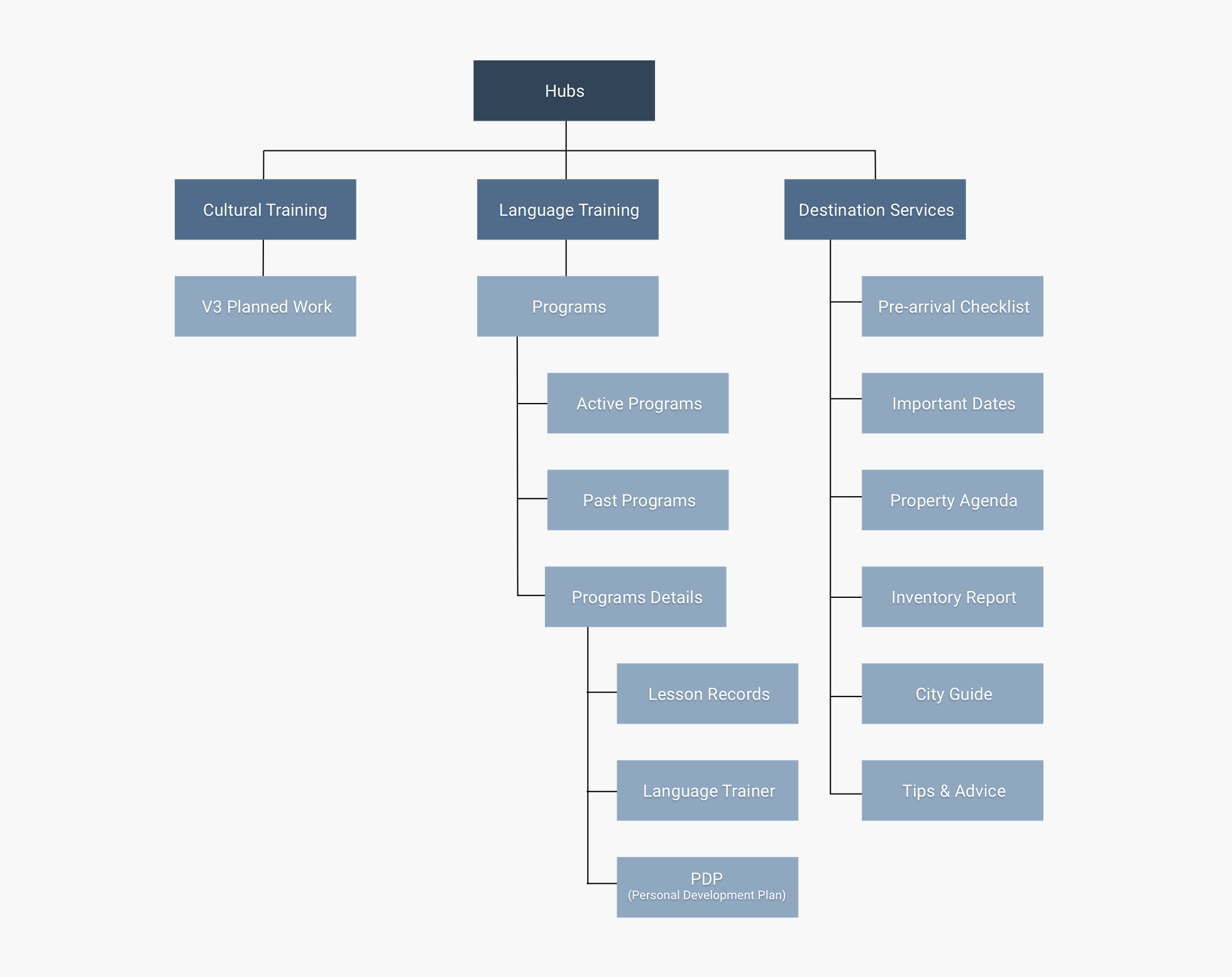
A detailed breakdown of IOR’s core service hubs.
Sprint 2: Visual Design
Wireframing
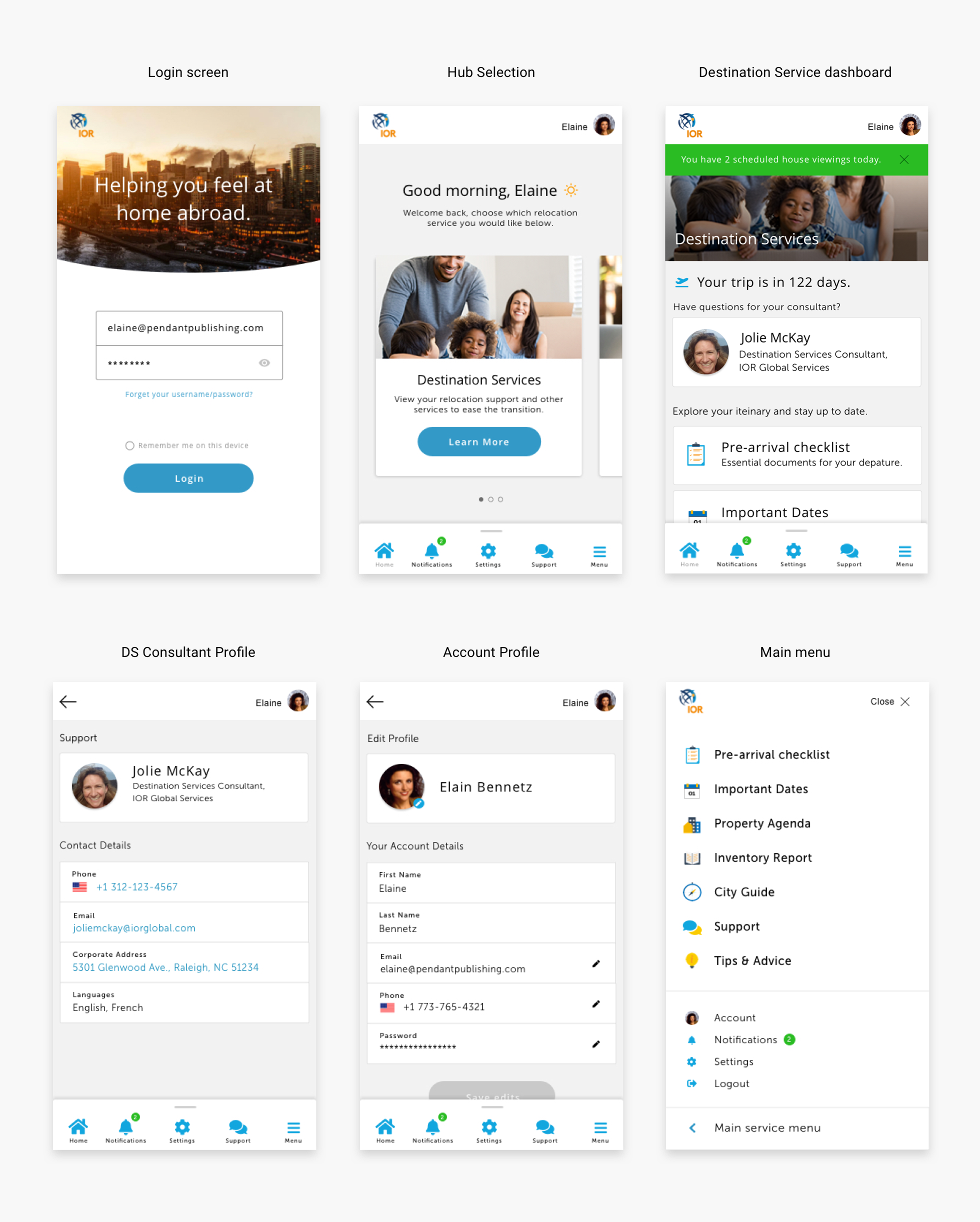
Businesses use paper. Organizations in every vertical have always relied on a certain quantity of paper, despite the rise of digital formats. After gaining initial insights from Discovery I worked with UX to analyze content types from IOR’s library of documents the consultants use as part of their job roles. These findings helped to inform design decisions as part of the wireframing process. Having a high-level understanding of these content types also helped when considering the reusibility of the design system to come.
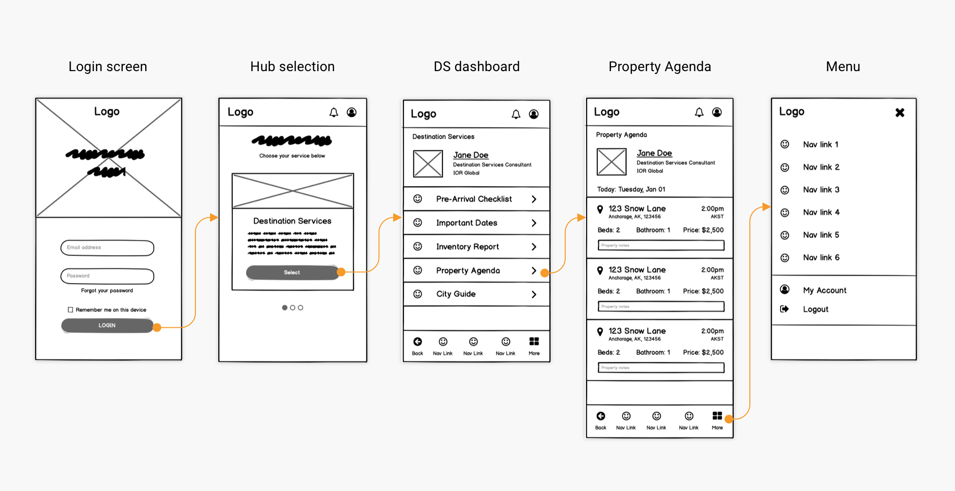
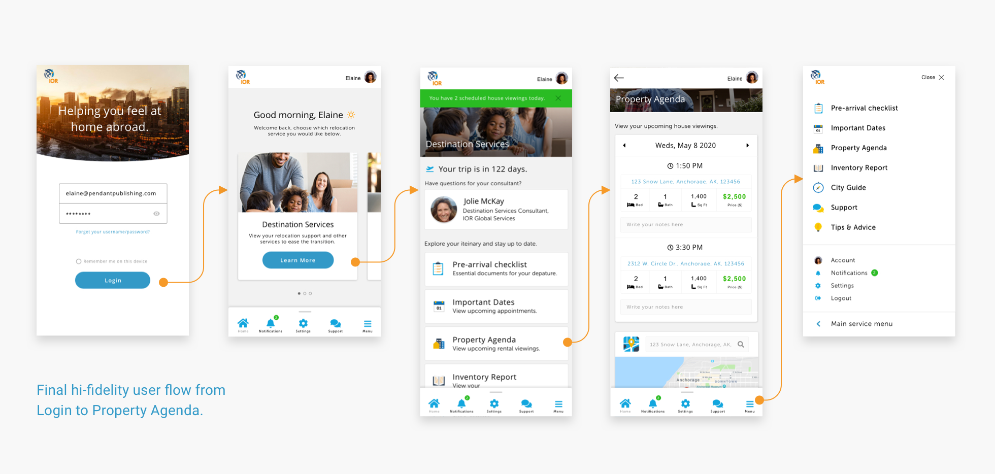
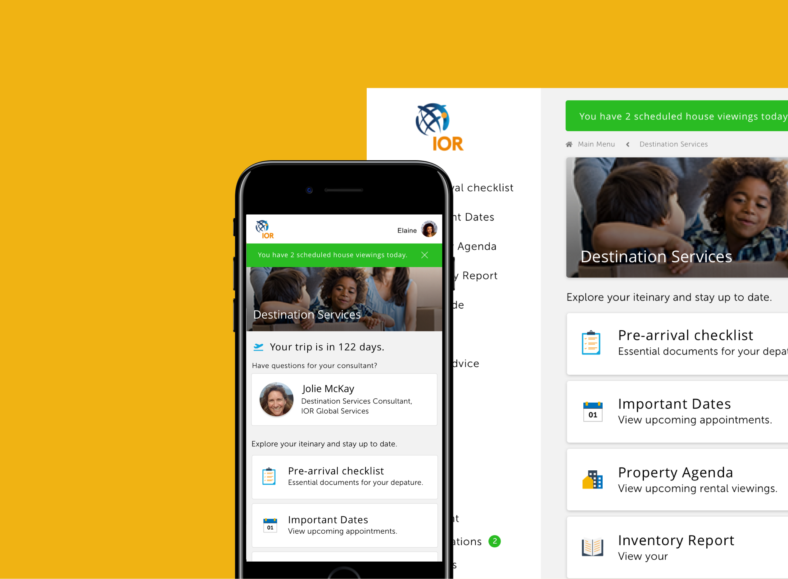
Wireframe showing a returning user flow from Login to Property Agenda.
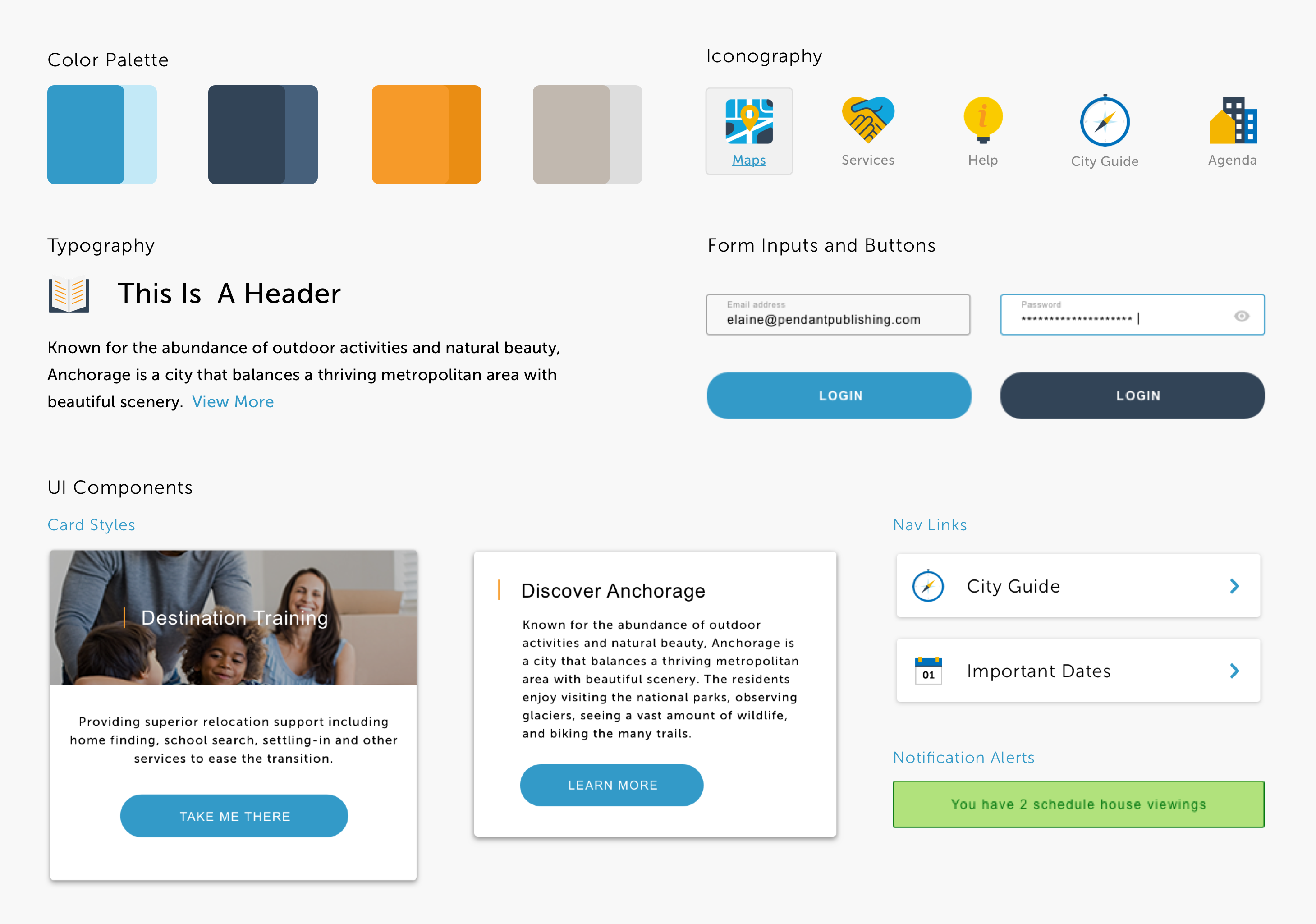
Style Guide
Never let anyone tell you moodboards aren’t important. They help with client adoption, by allowing them to see their brand in context and helps to determine the look and feel of the digital experiences.
To bridge the gap between moodboards and wireframes I worked with a UX designer to create what would become IOR’s component library. This style guide helped to affirm tangible, visual design elements, like colour palette, font, and user controls.
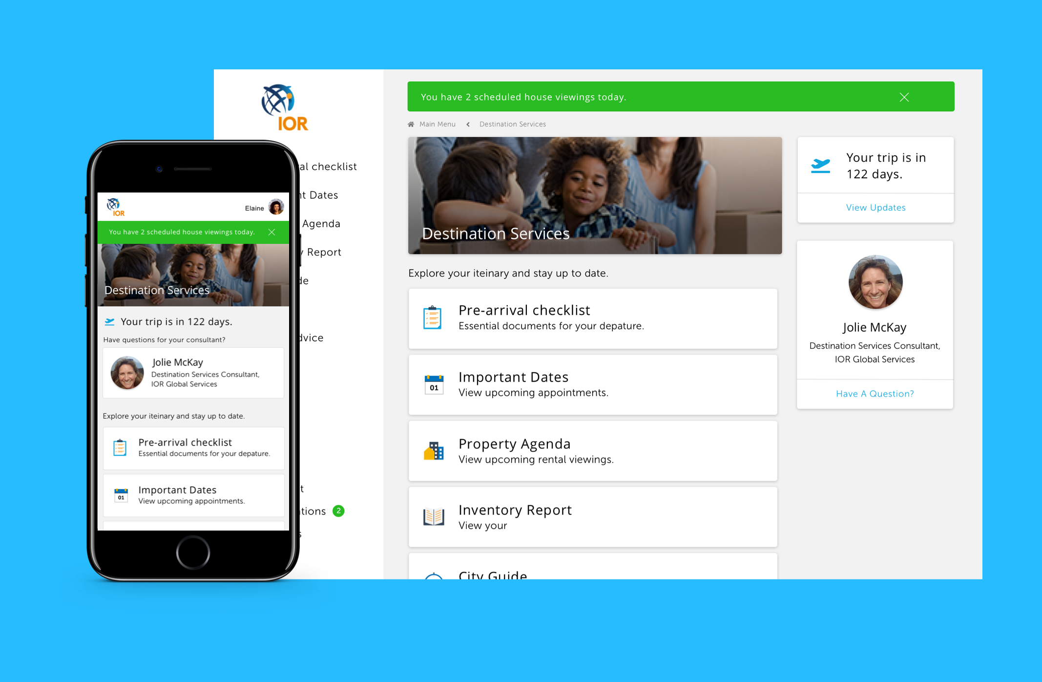
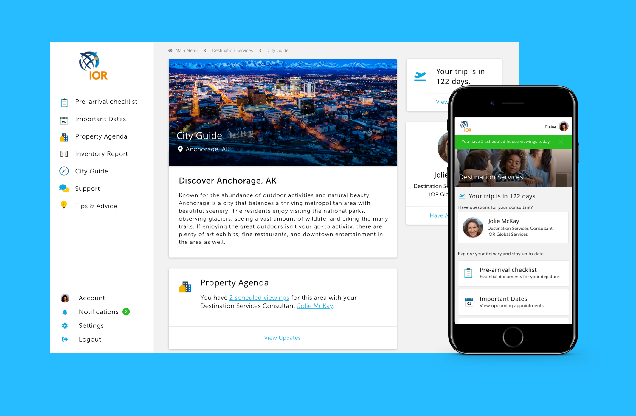
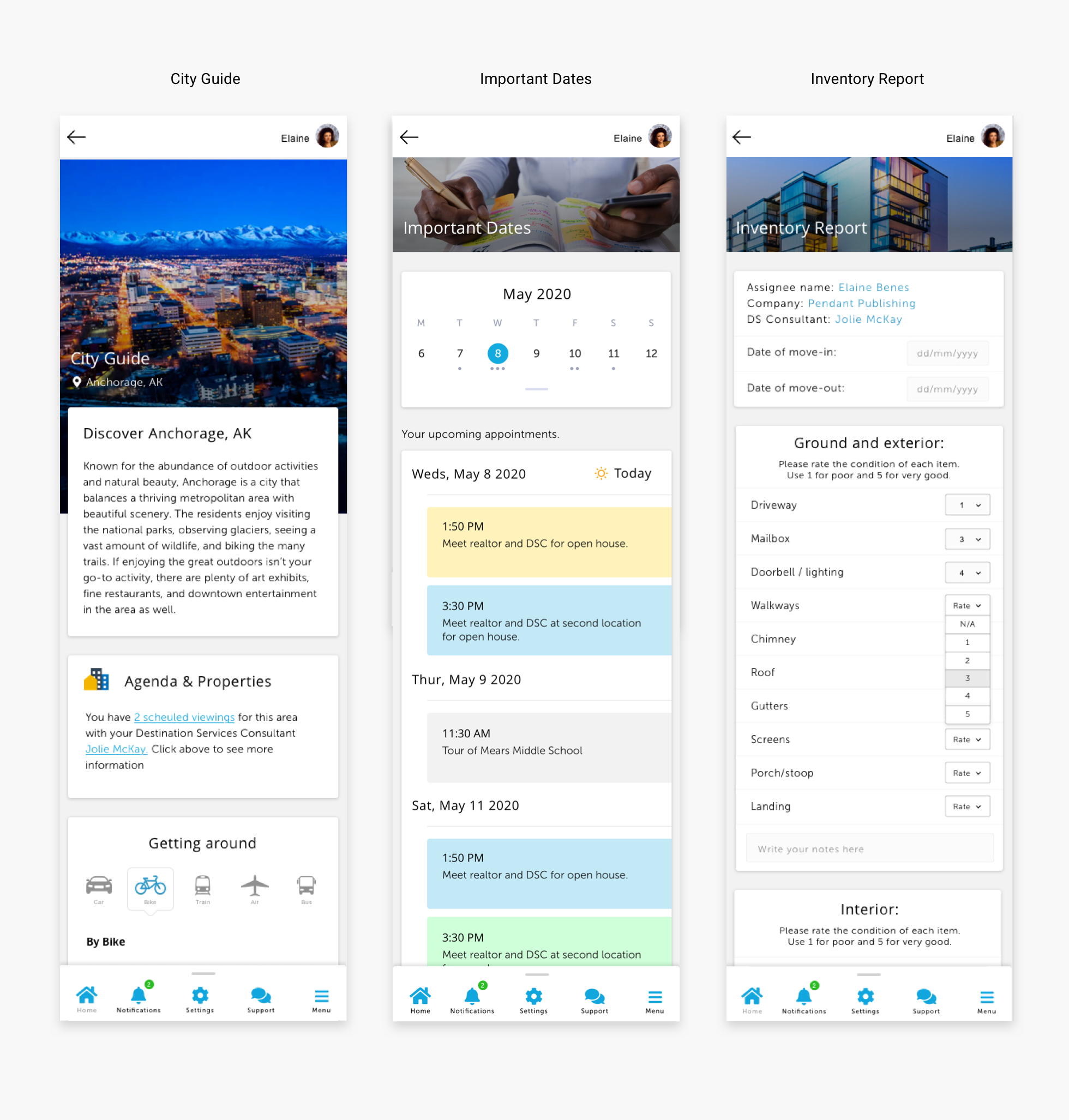
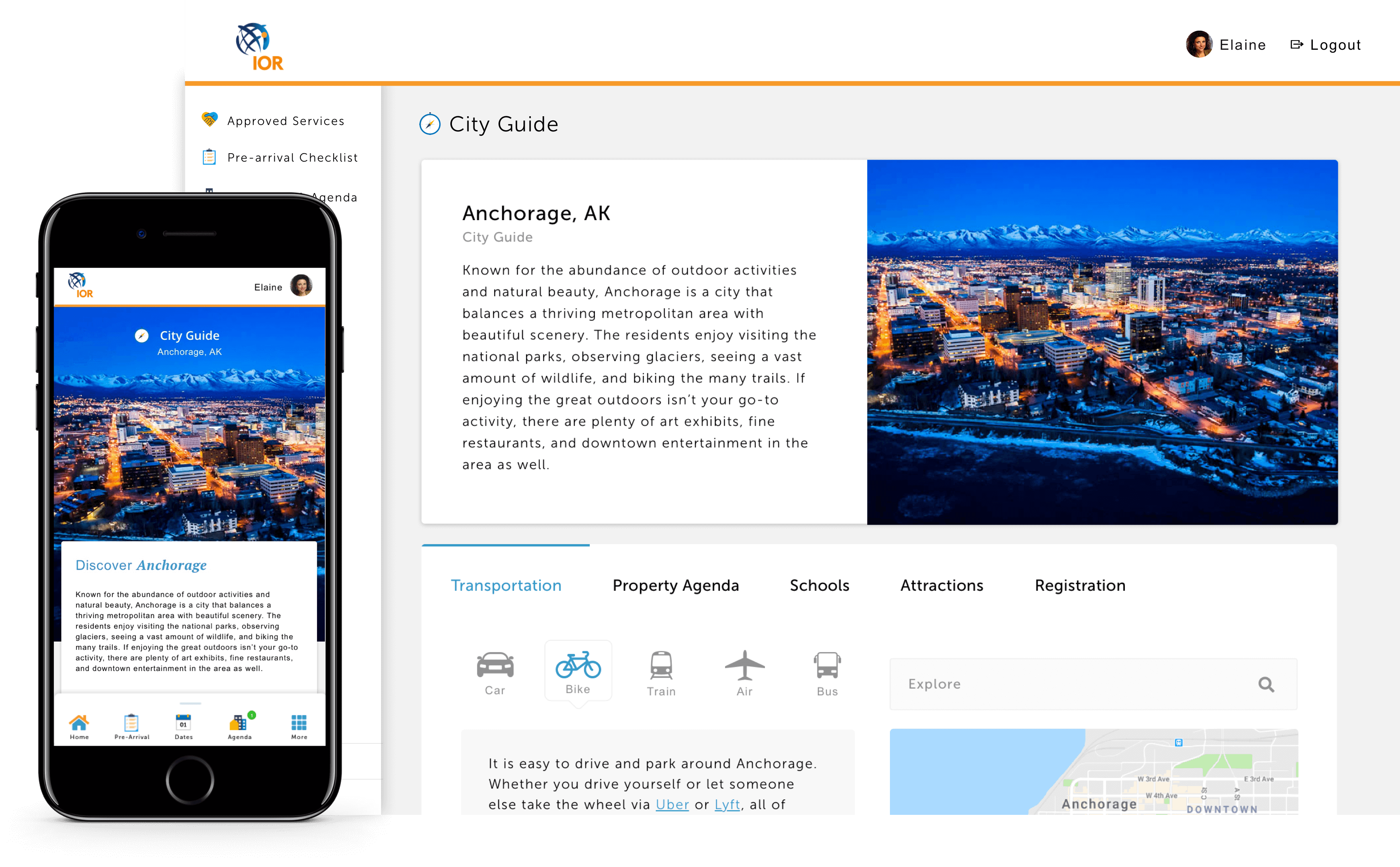
High Fiedlity Mockup
After the style guide was approved, I applied it to the mid-fidelity wireframes, while iterating on the consistency of the design along the way.
The system featured a few main components including containers, cards, a few user controls and custom iconography. Since the project had a focus on mobile-first, the core interface had to be mindful of desktop while still favoring smaller devices. This presented a unique challenge when you consider the layout and white space of an app compared to its desktop counterpart.
To address this challenge I utilized responsive design systems like Bootstrap and Material Design as a visual framework. This helped to efficiently build the components library while allowing me to focus on visual and brand design. The final product features consistent, reusable, user controls with a minimal touch.