My Role in the IDT
I worked as the lead designer for the Navigator Support project. My responsibilities ranged from developing user-centric workflows and design concepts, to creating prototypes, mockups and defining the visual language behind the new brand expression. Other members of the IDT included front-end devs, back-end devs and PIC's Director of Navigator Operations.

Design Challenge
Leaverage agile full-cycle design and development methods to build an user-centric graphic interface. Careful consideration and planning was used to automate the manual workflow that Navigators use daily. Here are a few factors we had to consider:
- Understanding HIPPA Security concerns
- Addressing HIPPA compliance
- Building intuitive UI from personlized processes
- Translating complex health data into visual interpretations
- Creating visual translations for complex health data
- Lack of reliable data to inform design decisions
- Designing for drastically shifting insurance landscape
- Implementing stakeholder business intellegience features
Design Process
I decided to follow IDEO's Human-Centered Design and Lean UX Design Thinking process to make sure that my design decisions were supported by user research and feedback.

Discovery
In order to begin building a list of requirements the Innovation Design Team turned to the company's greatest asset, it's Navigator network. Working closely with the project manager, I helped to create and lead design thinking workshops that engaged Navigators to divulge meaningful concerns in a constructive and creative way.
Workshop One
Through the course of the three workshops our goal was to better our understanding in the current process of enrolling consumers, reveal pain points in the patient experience, and draft a foundation for the new streamlined process.
Workshop Two
Through the course of the three workshops our goal was to better our understanding in the current process of enrolling consumers, reveal pain points in the patient experience, and draft a foundation for the new streamlined process.
Workshop Three
Through the course of the three workshops our goal was to better our understanding in the current process of enrolling consumers, reveal pain points in the patient experience, and draft a foundation for the new streamlined process.
Through the course of the three workshops our goal was to better our understanding in the current process of enrolling consumers, reveal pain points in the patient experience, and draft a foundation for the new streamlined process.
Key takeaways from Discovery:
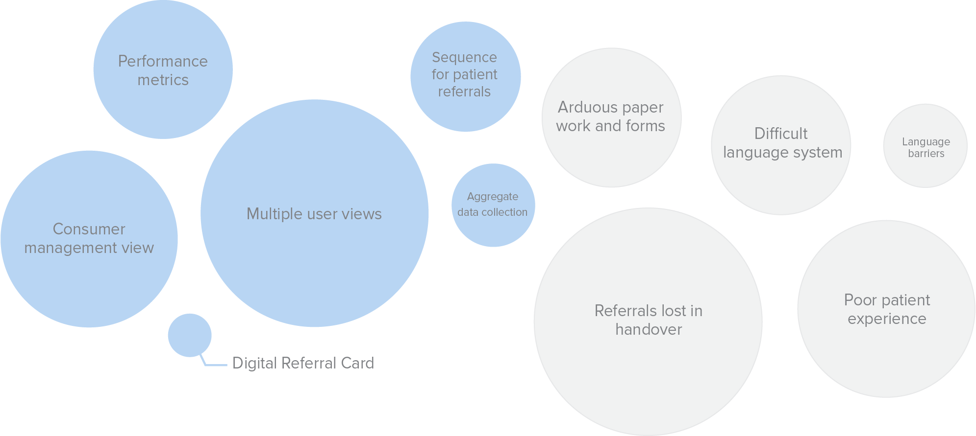
The above association bubble chart was used to roadmap key features of the new digital navigation process. It also focused our attention to the some of the gaps (pain points) in the current Navigator process.
Ideation
Using insights gained from Discovery — and the ample user feedback from our navigatos — we determined that a dashboard would be necessary to house the features that would support the business model goals and improvement in the Navigator process
Deciding on a dashboard was the first step to conceptualizing the collective thoughts into phyiscal shapes, that would later become a user interface.
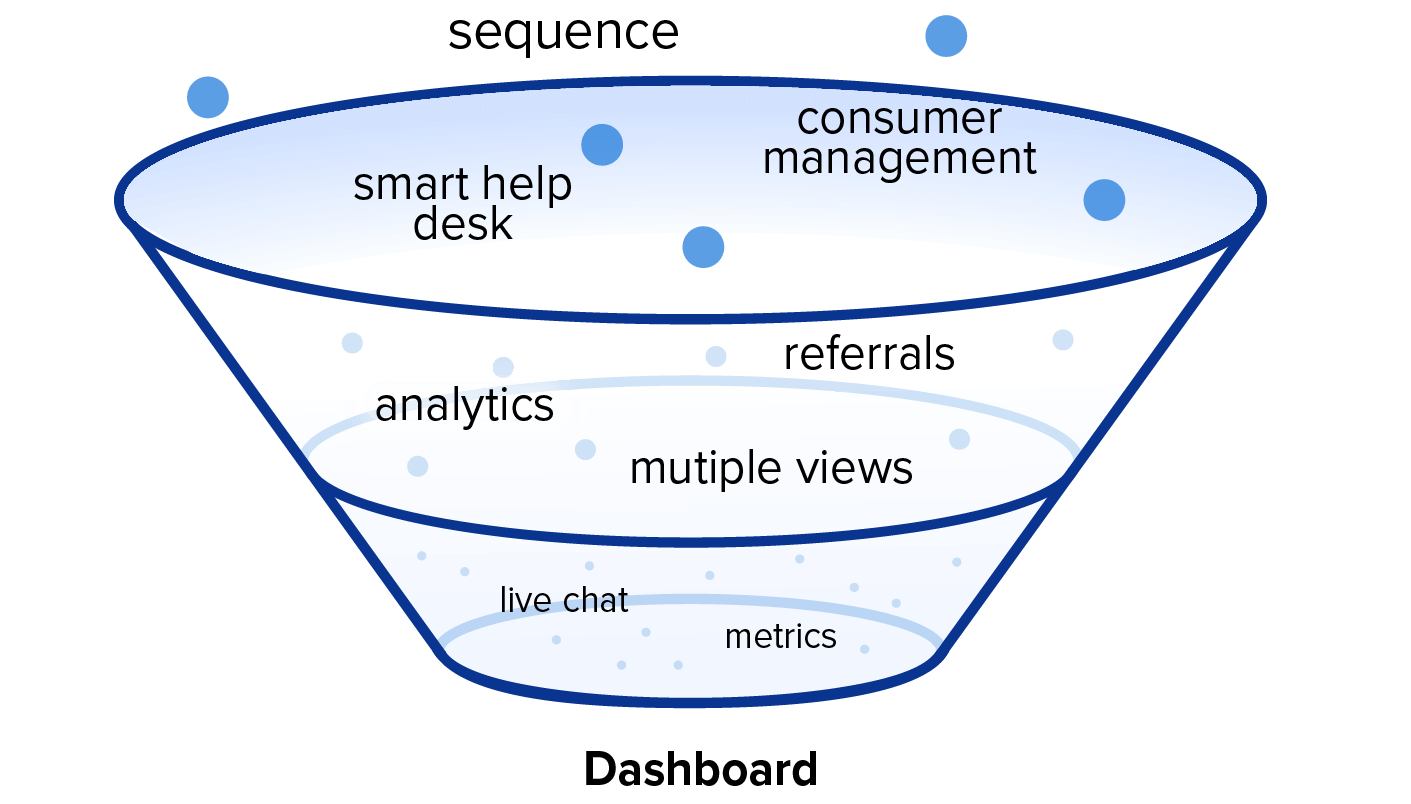
Early lo-fi concept wireframes of dashboard focused on a cohesive visual layout that would lend itself to a intuitive user workflow. Adding a fixed sidebar menu, clear typograhy hierarchy, and a modular card design were the first design decisions to simplyfing navigation.
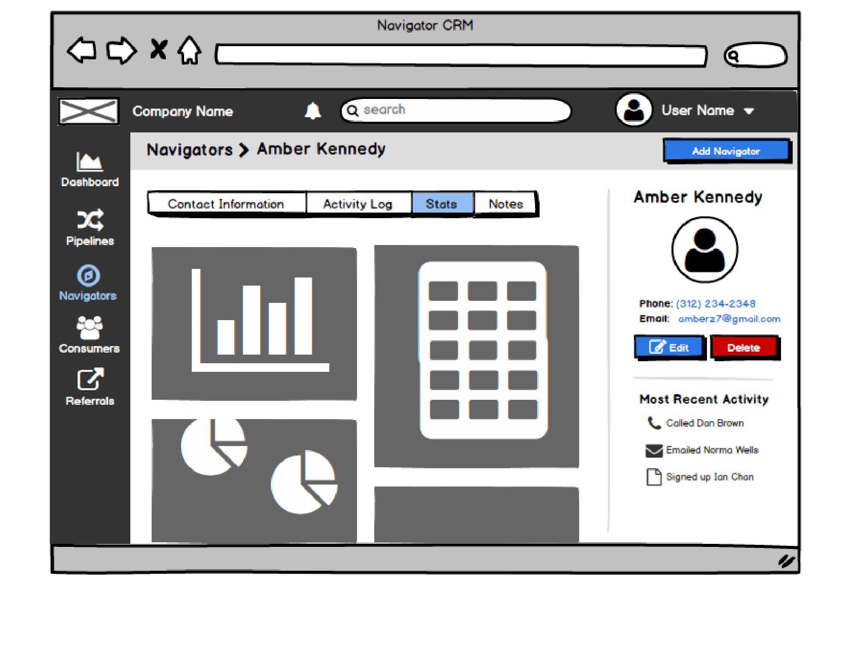
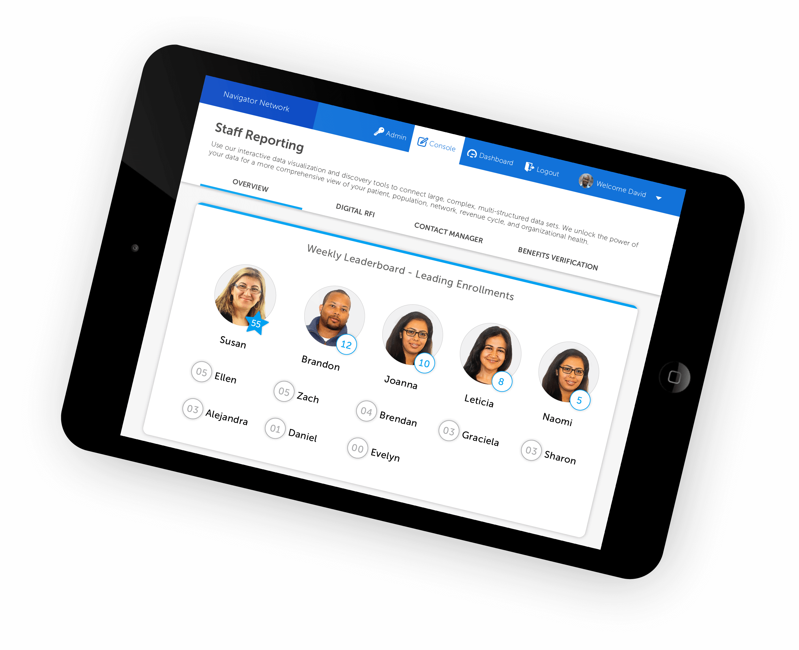
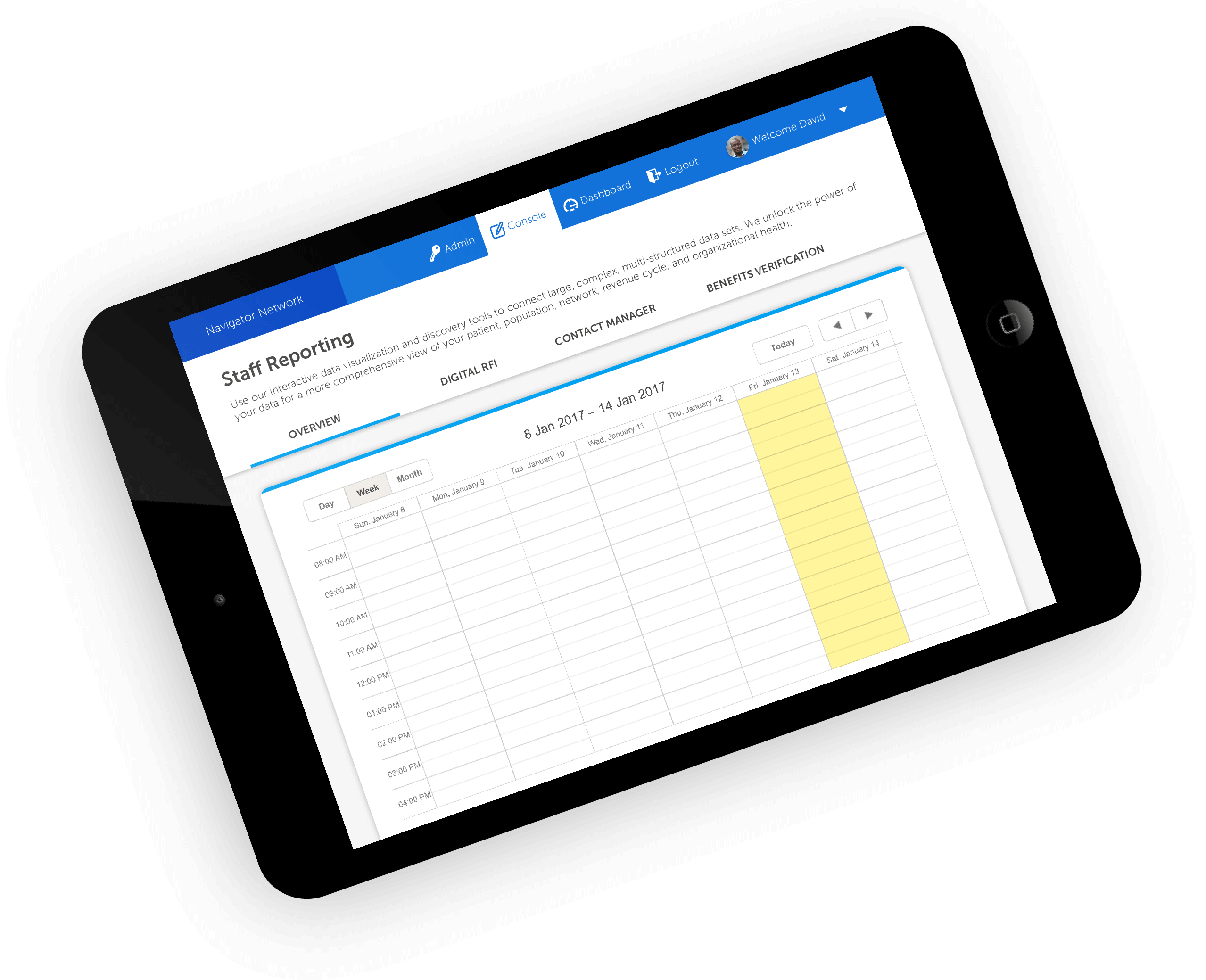
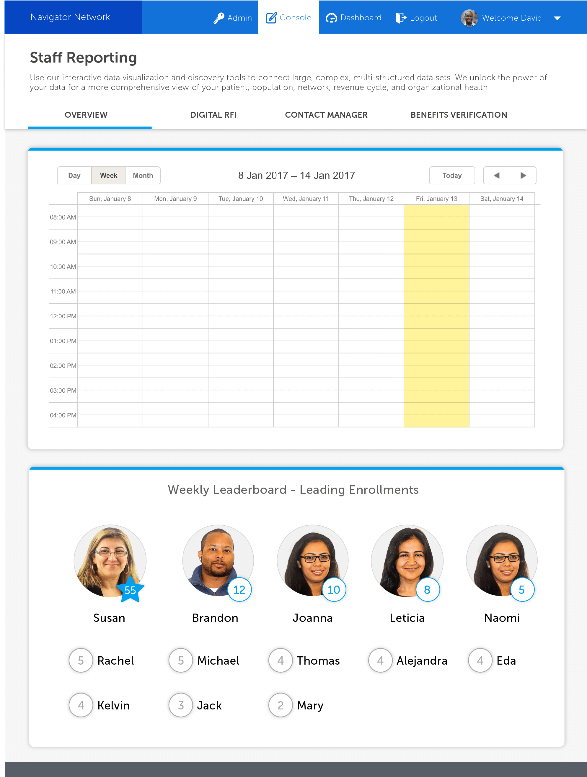
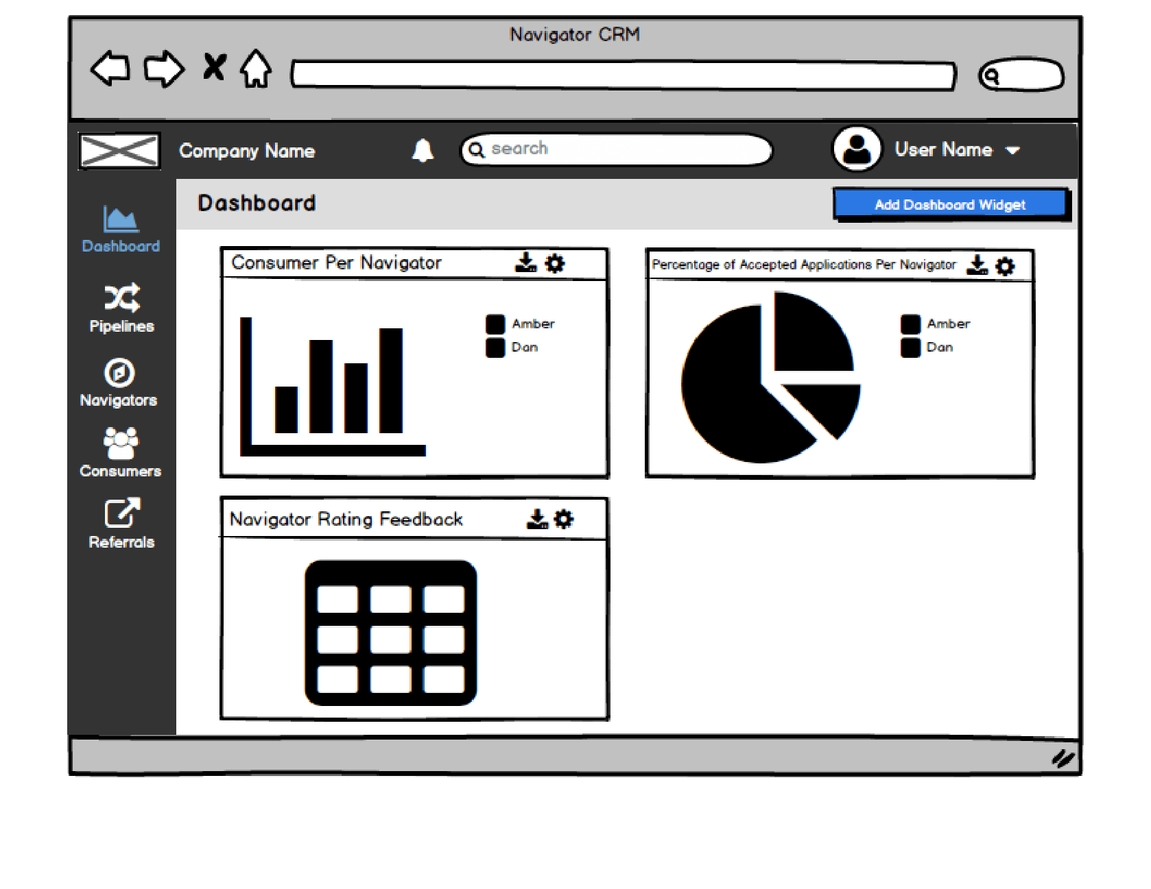
Navigator Metrics view
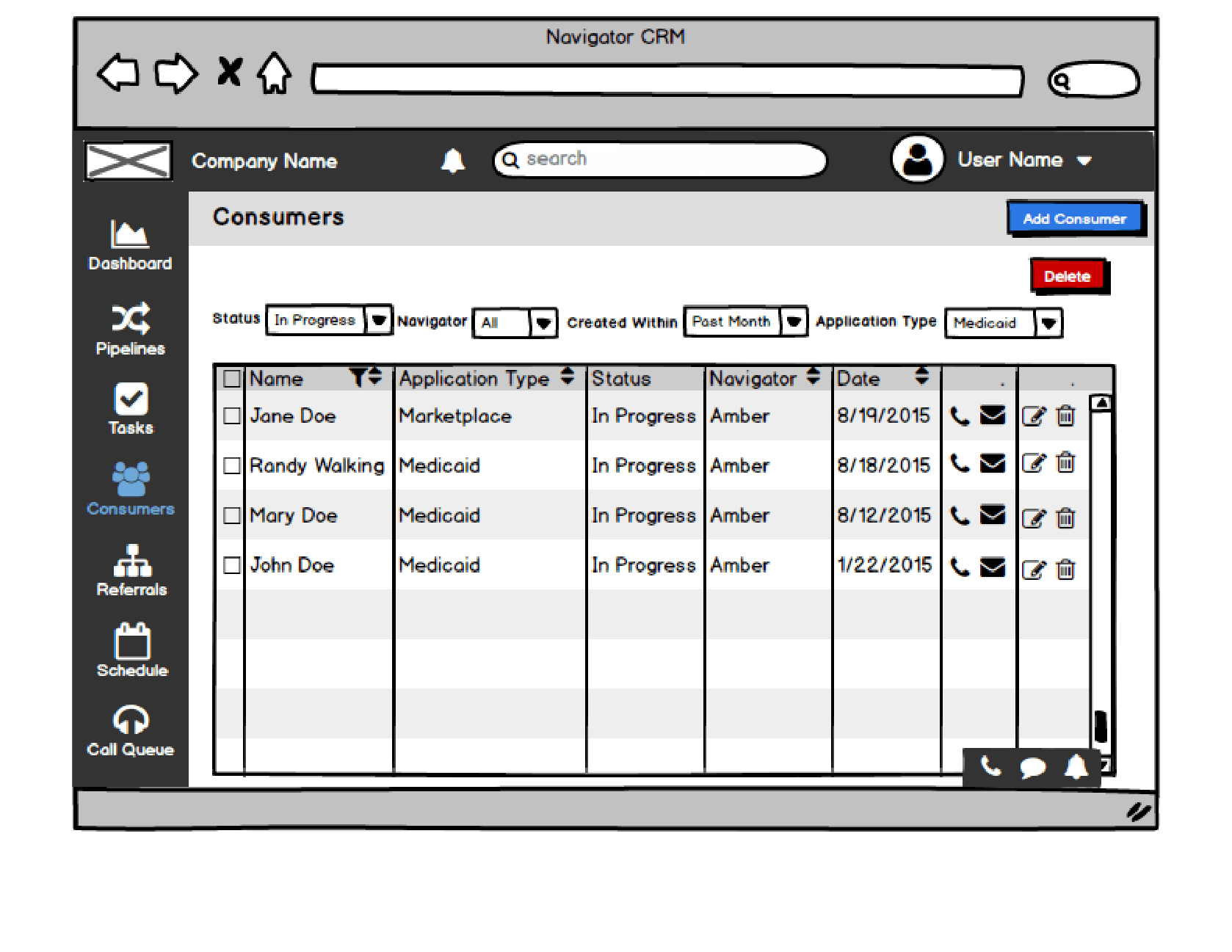
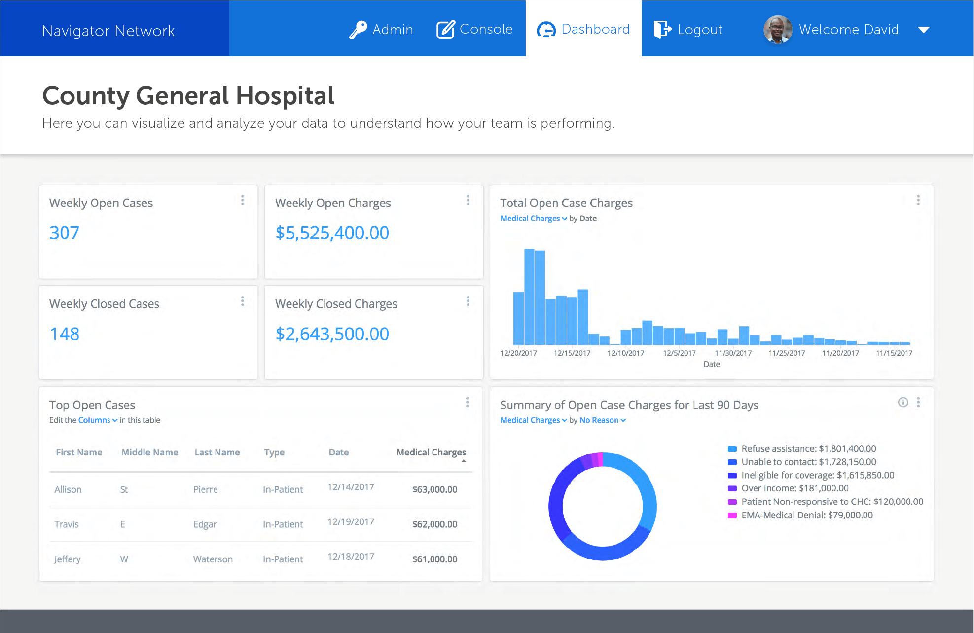
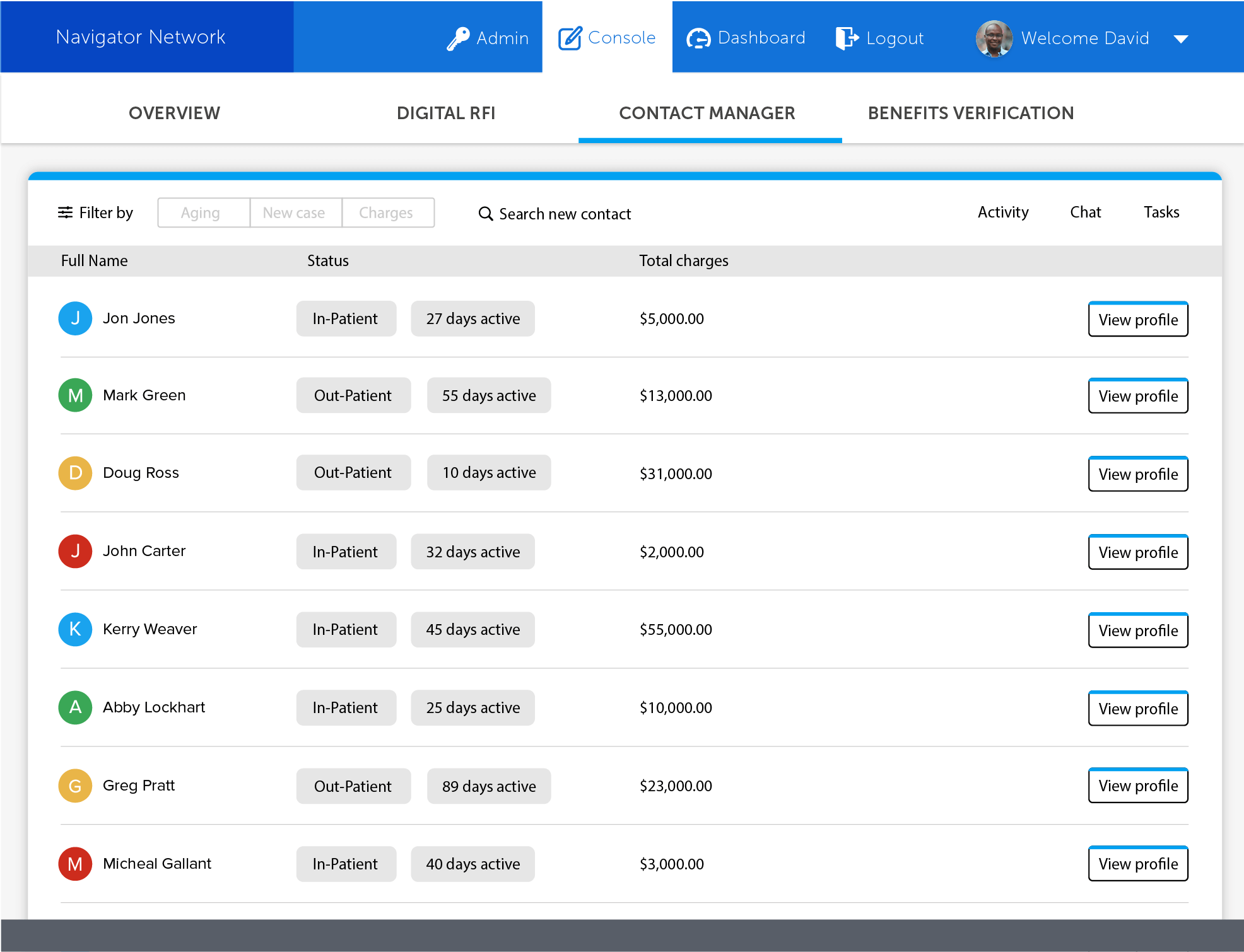
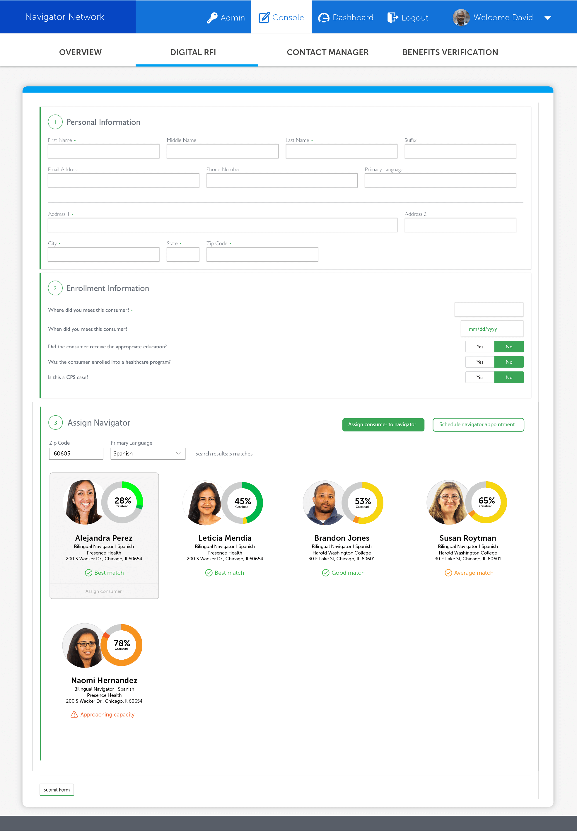
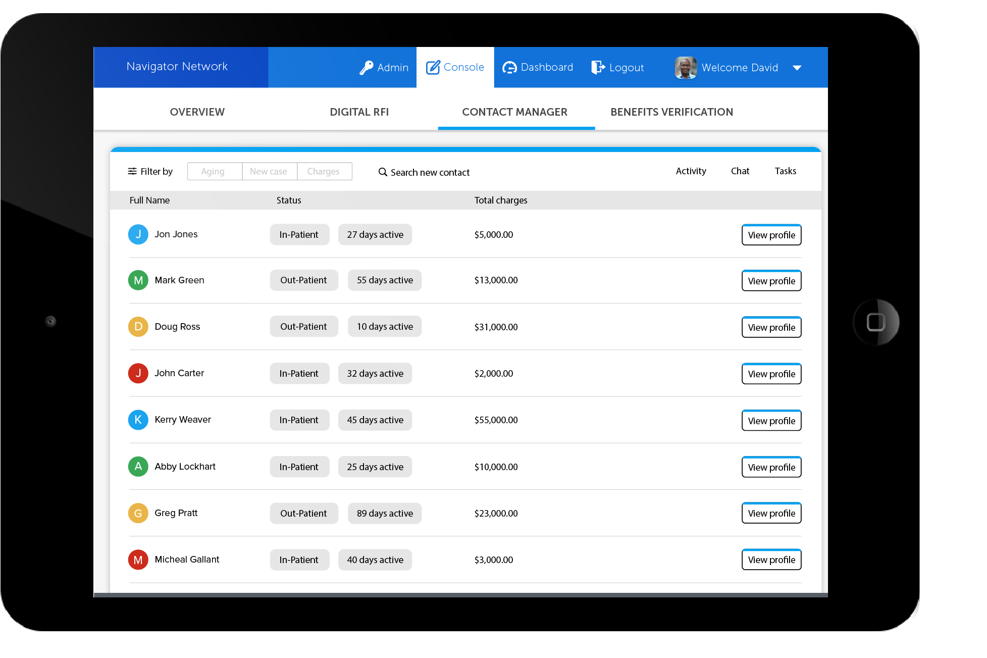
Consumer Manegment view
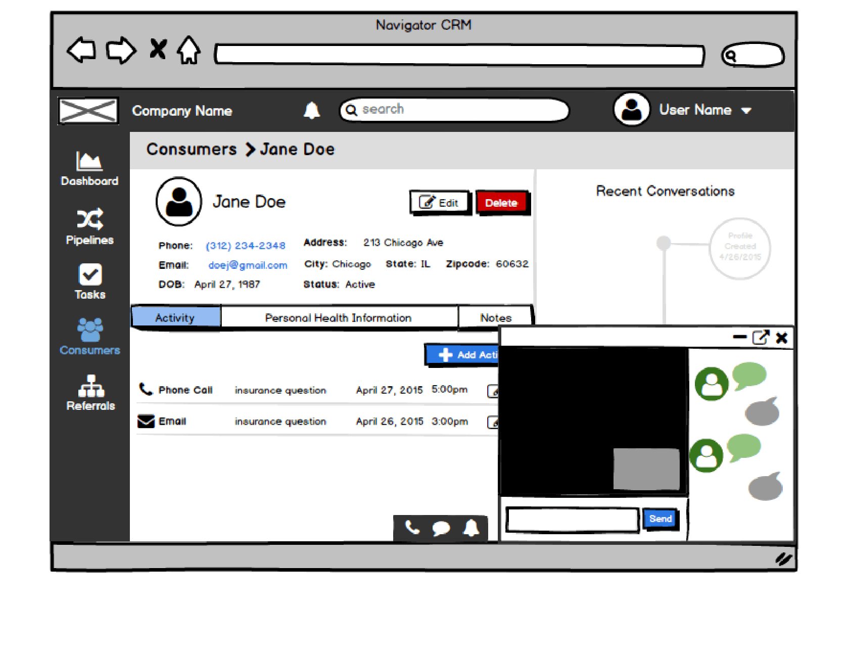
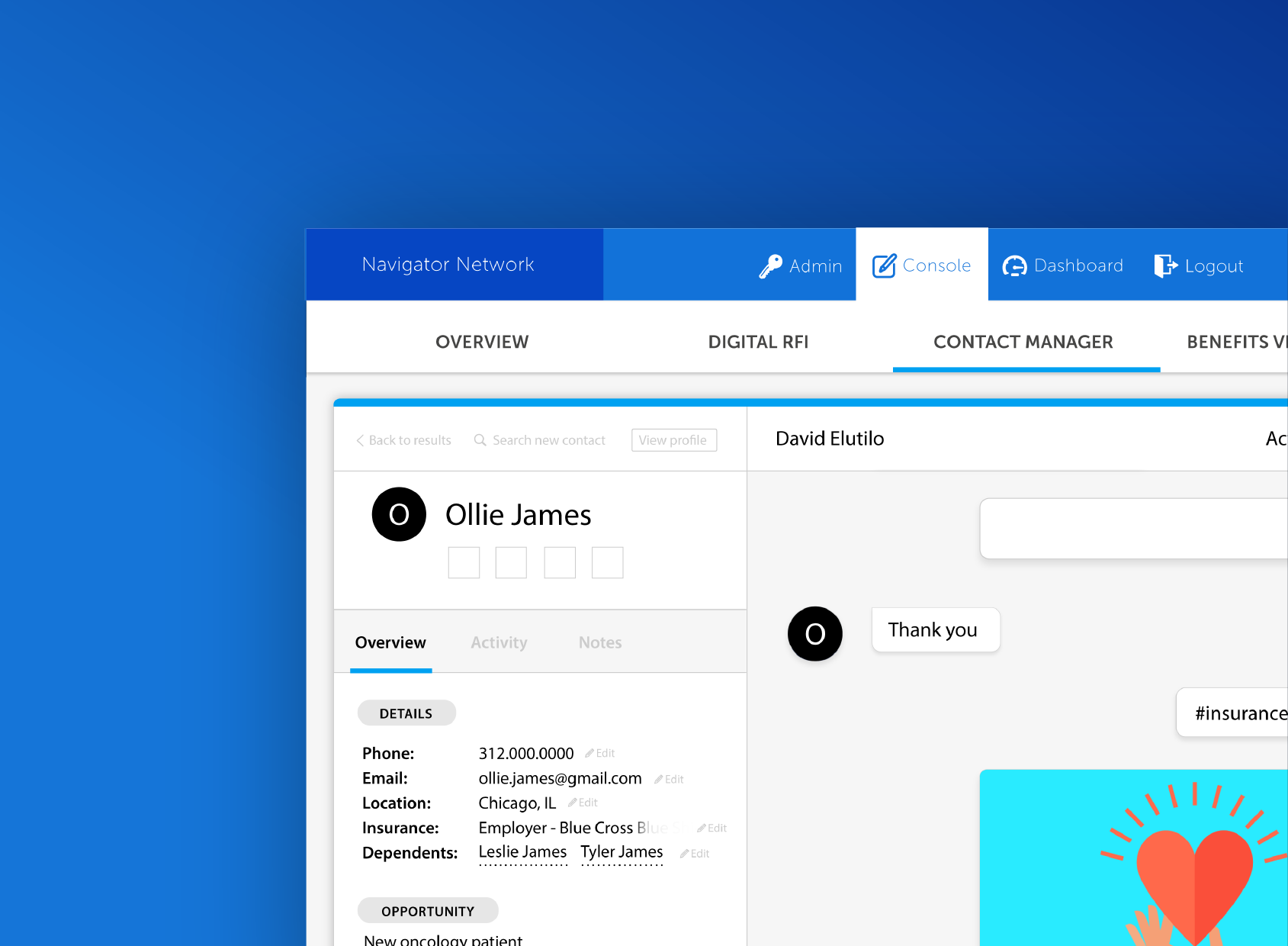
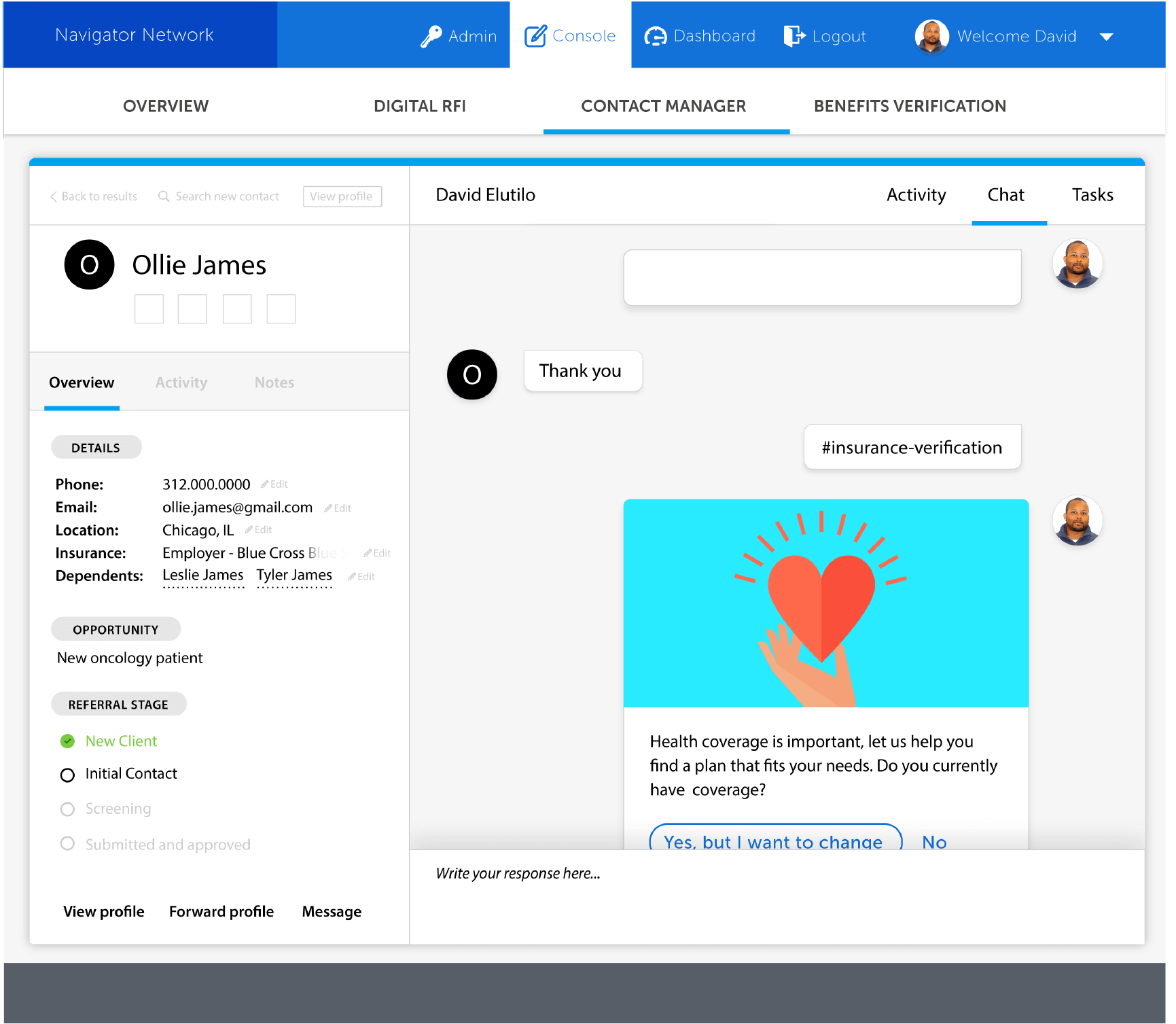
Navigator view of conversational marketing tool (Patient Assist™)